Our Breakthrough Awaits Us.
Lululemon Train.
Context
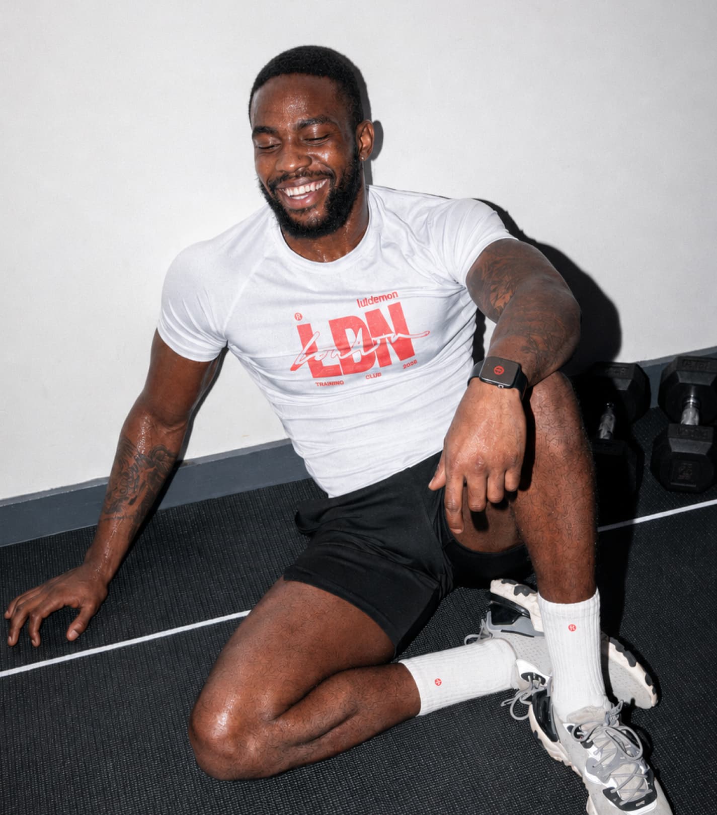
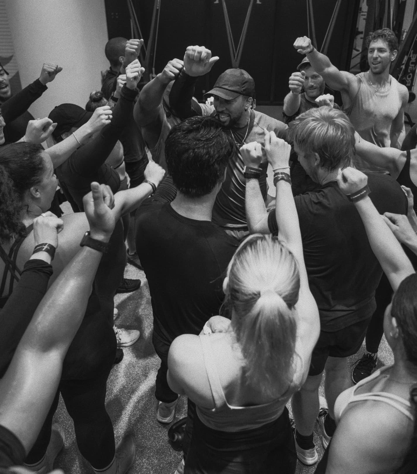
Training culture has moved beyond individual achievement towards shared progress, where commitment is now measured as much by consistency and community as it is by performance. While Lululemon had built strong equity in yoga and female-led wellness, it lacked permission in training culture. The key challenge was to build credibility within performance focused spaces while connecting with a broader audience.

Unlock
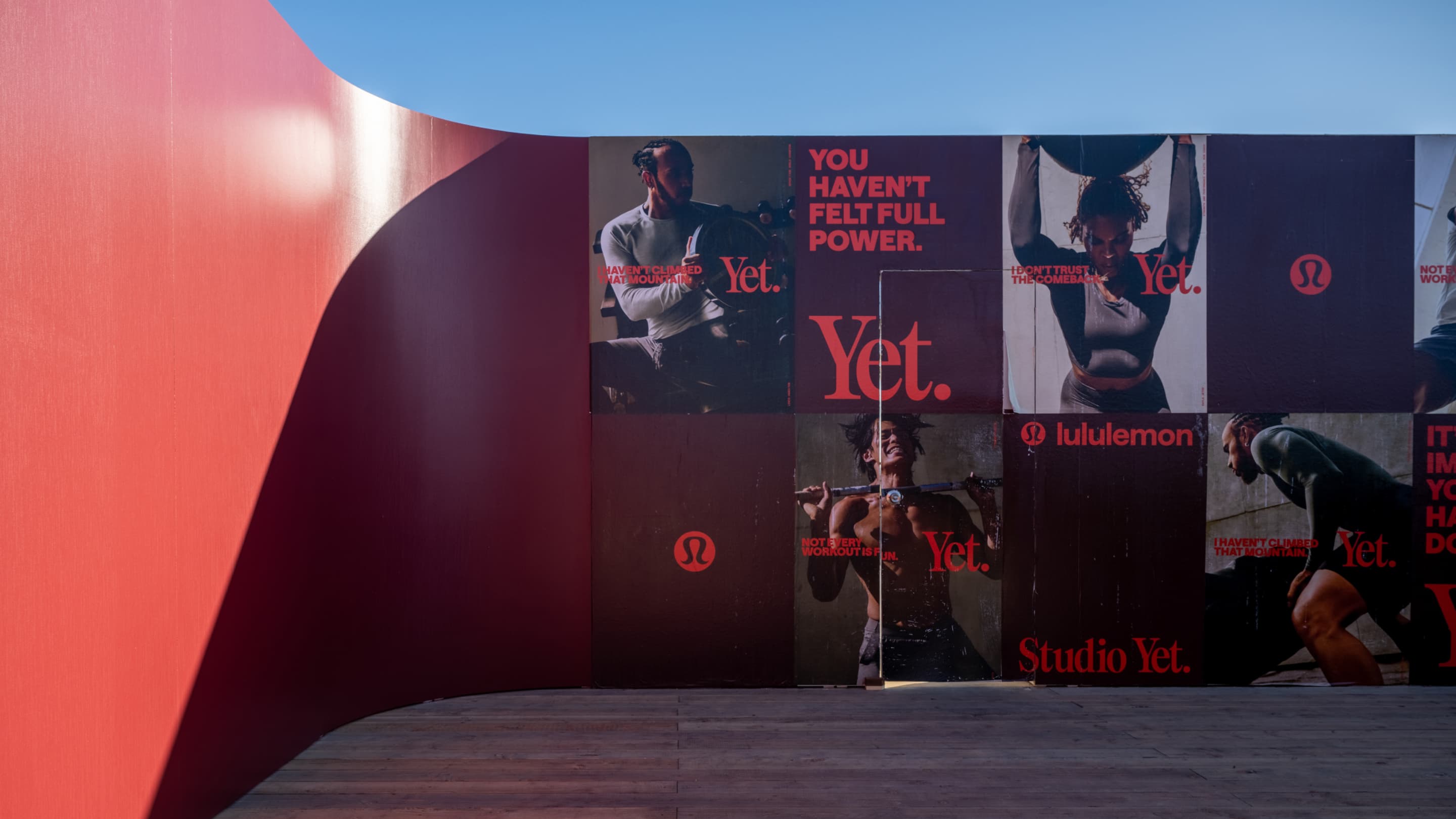
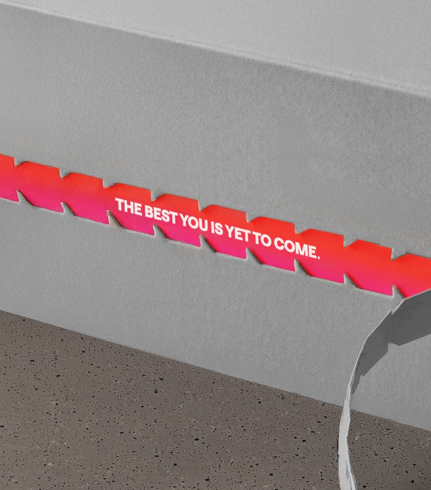
The category often celebrates perfection when most of the hard work actually happens in failure. Progress is not the cleanest lift or the perfect rep - it is the incomplete attempt that keeps someone coming back. The organising idea “Yet” turns that moment into proof, shifting behaviour from performance display to persistence. It rewards repetition, discomfort and showing up again, while rejecting the polished finish and performative fitness culture that dominates the category. The mechanism is simple and precise: if failure is reframed as unfinished progress, the motivation to continue becomes internal rather than external.
Create
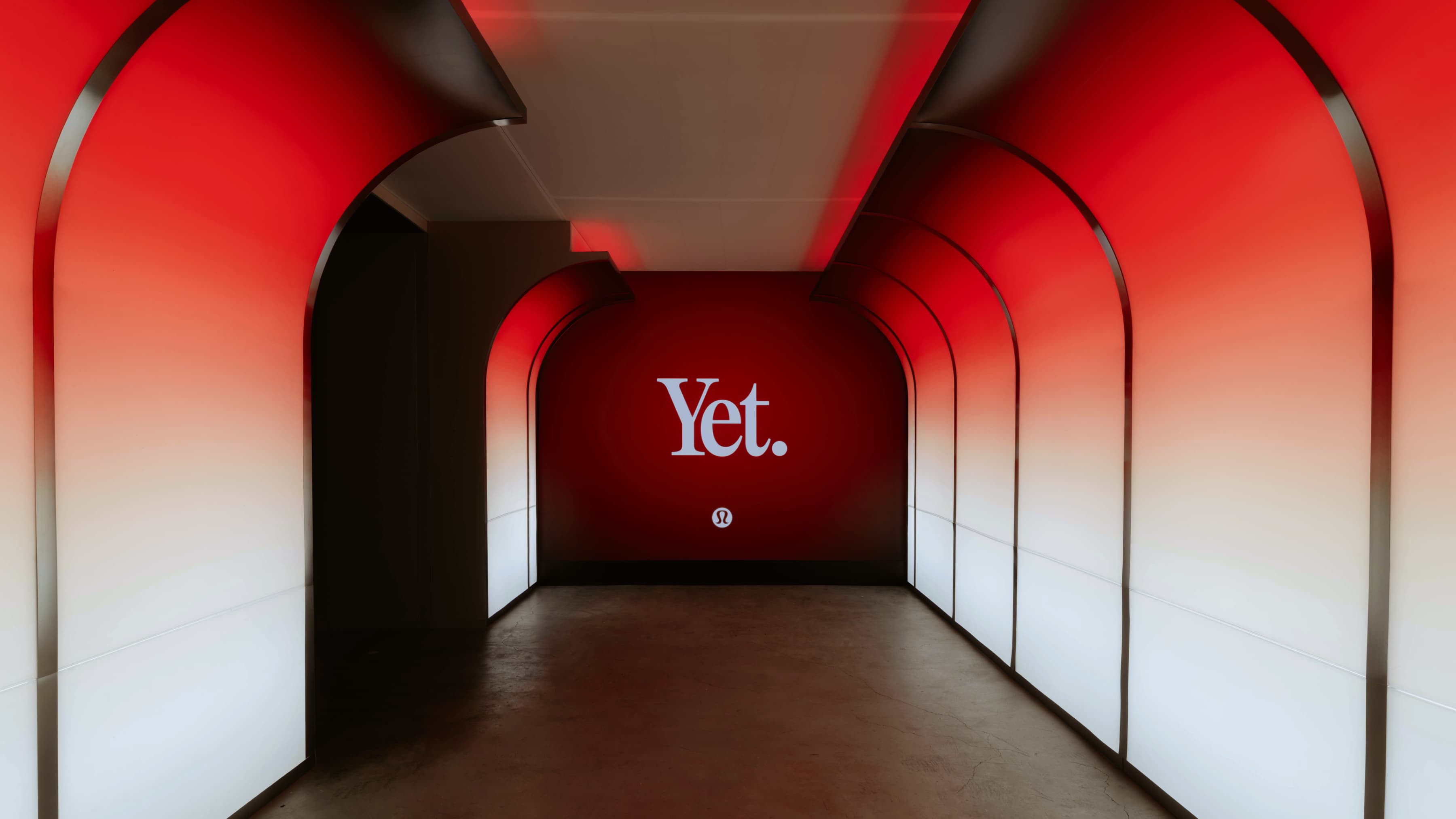
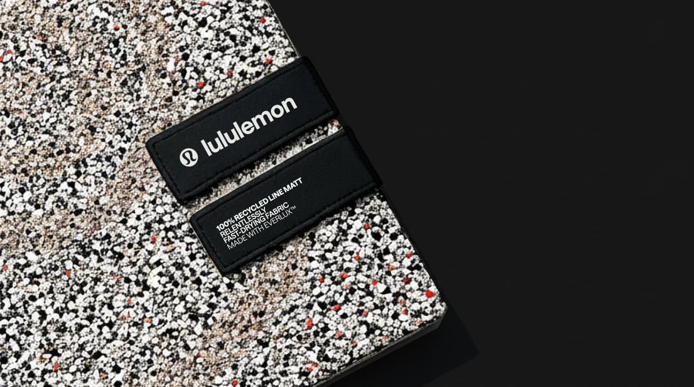
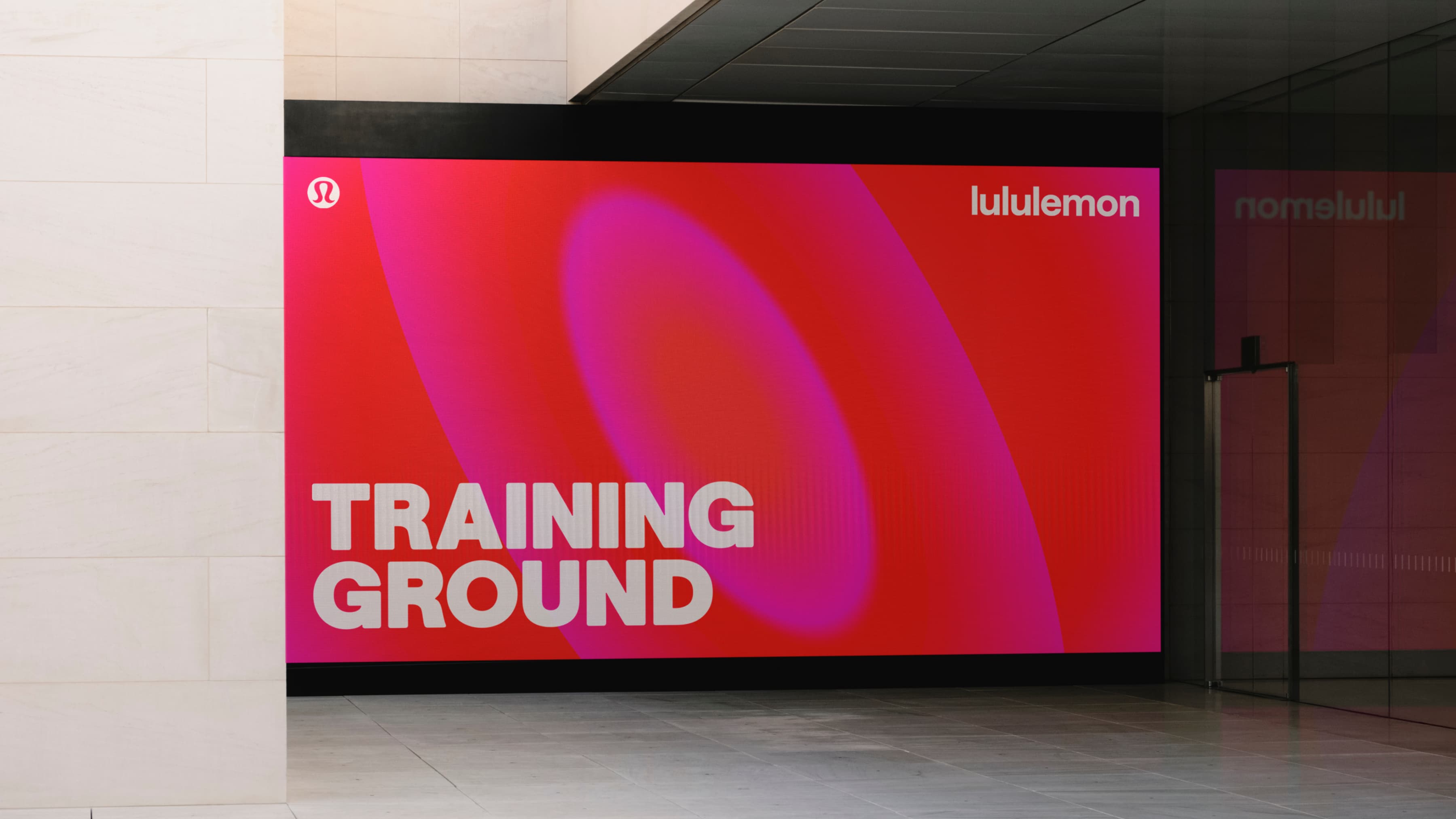
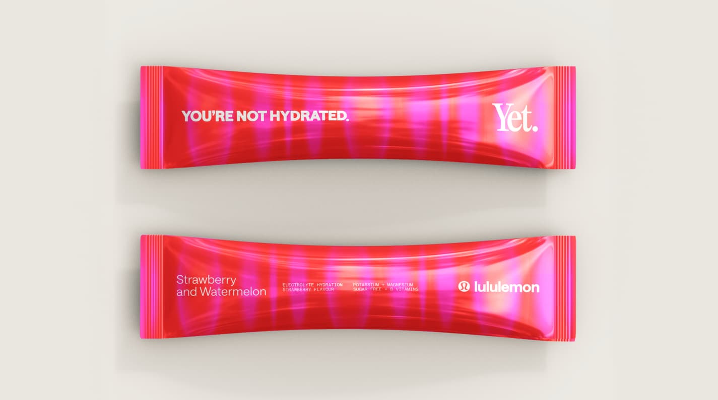
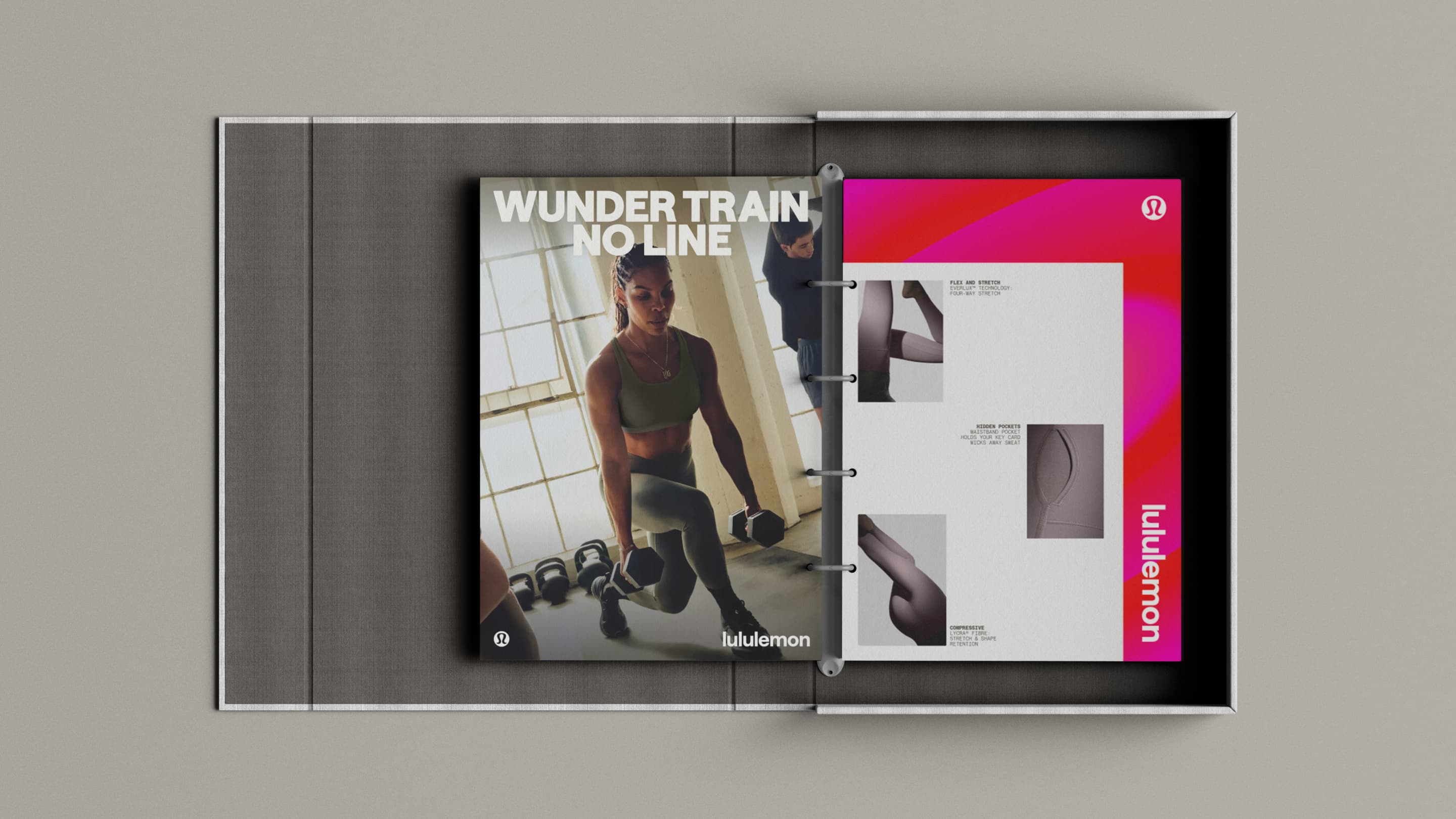
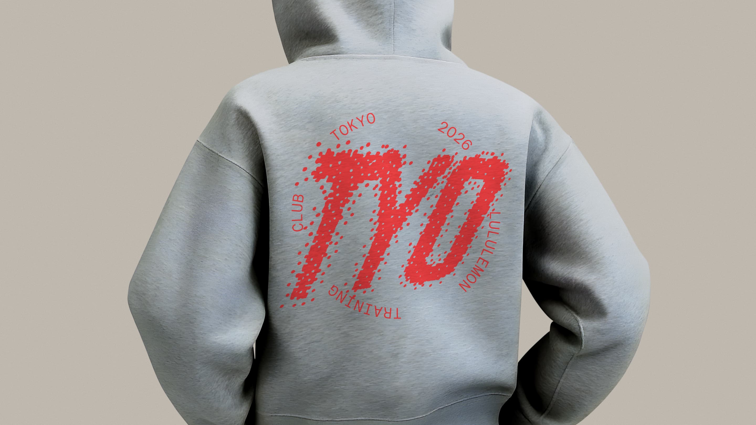
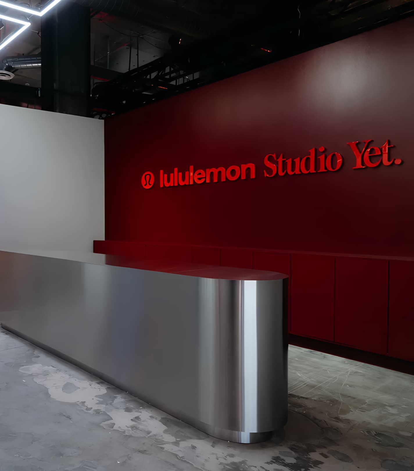
“Yet” was built as the campaign structural device, anchoring every message in suspension of a breakthrough moment. The logotype uses a bespoke cut of KH Giga with softened terminals, tight tracking, and a full stop to tie in Lululemons hero marque, trading sharp performance aggression for controlled tension that feels both dynamic and human.
Typography extends the master brand using a custom cut tailored for the Train franchise ‘Saans Sculpted’ used in a heavy weight, offset with a light Mono for technical clarity. This tightly controlled typographic system was built to create visual pressure, reinforcing the idea of effort being compressed before release.
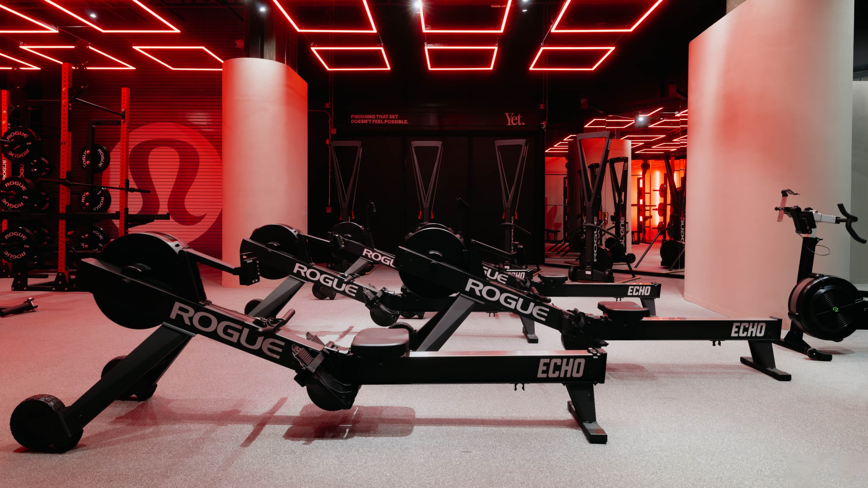
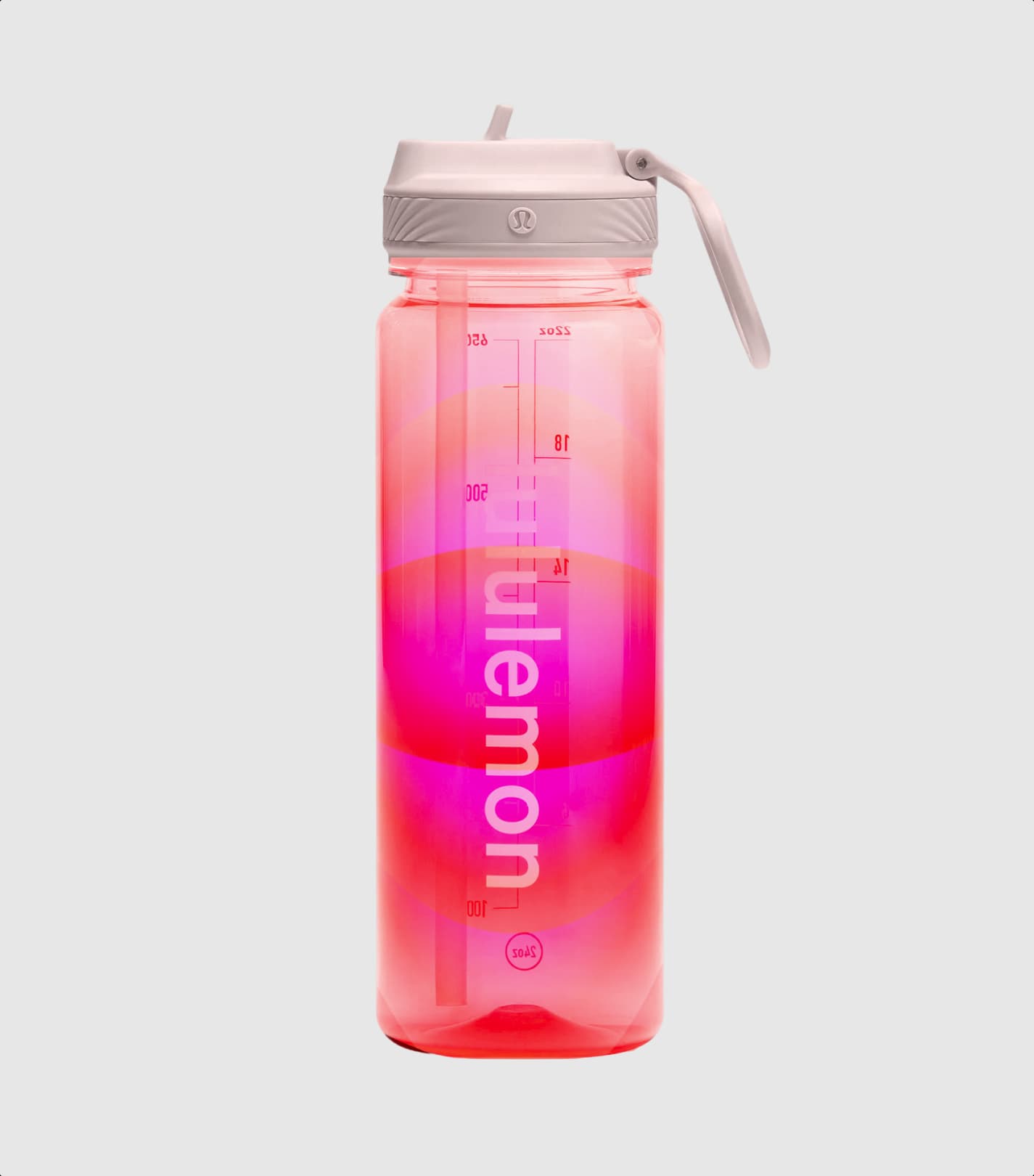
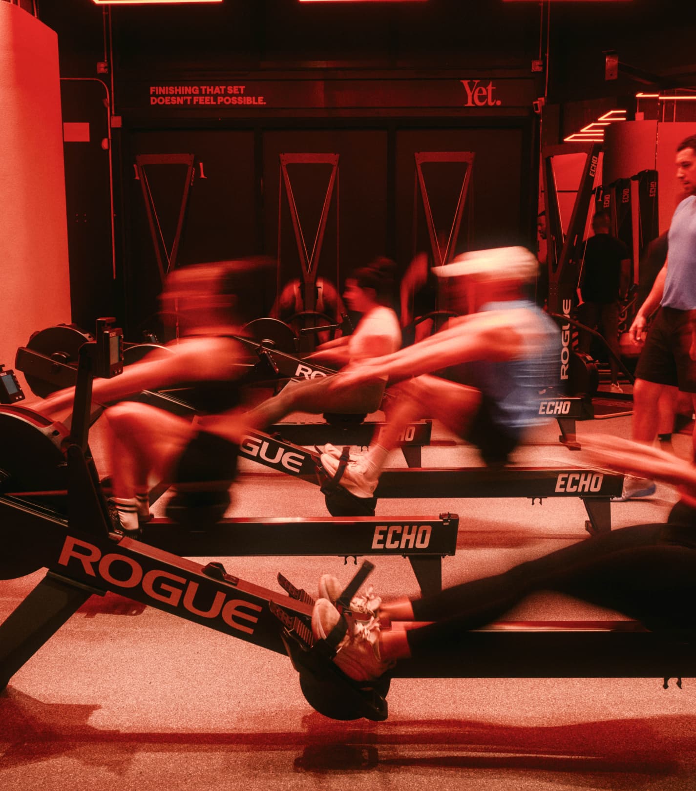
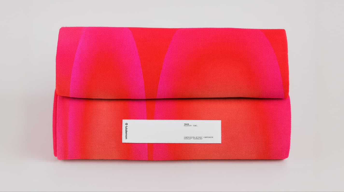
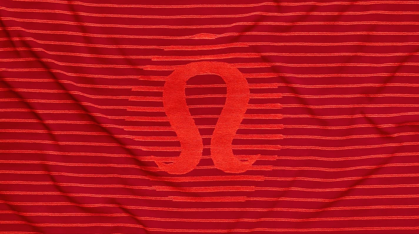
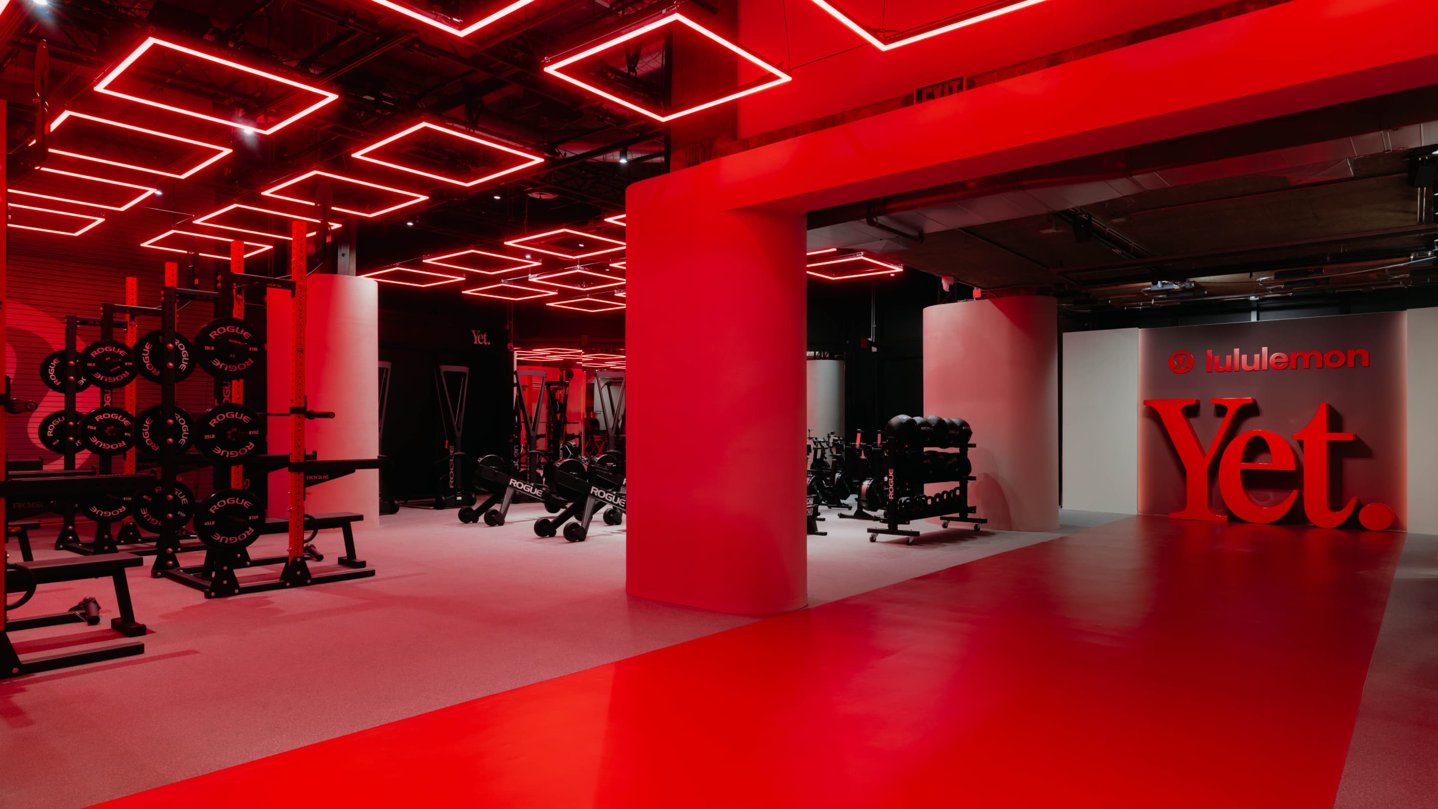
The colour palette centres on Lululemons hero ‘Hot Heat’, fed into high-intensity gradients and radiating patterns that express force and resistance. In motion, these visual patterns allowed the identity to move in way that links directly back to recognisable training cues.

Become
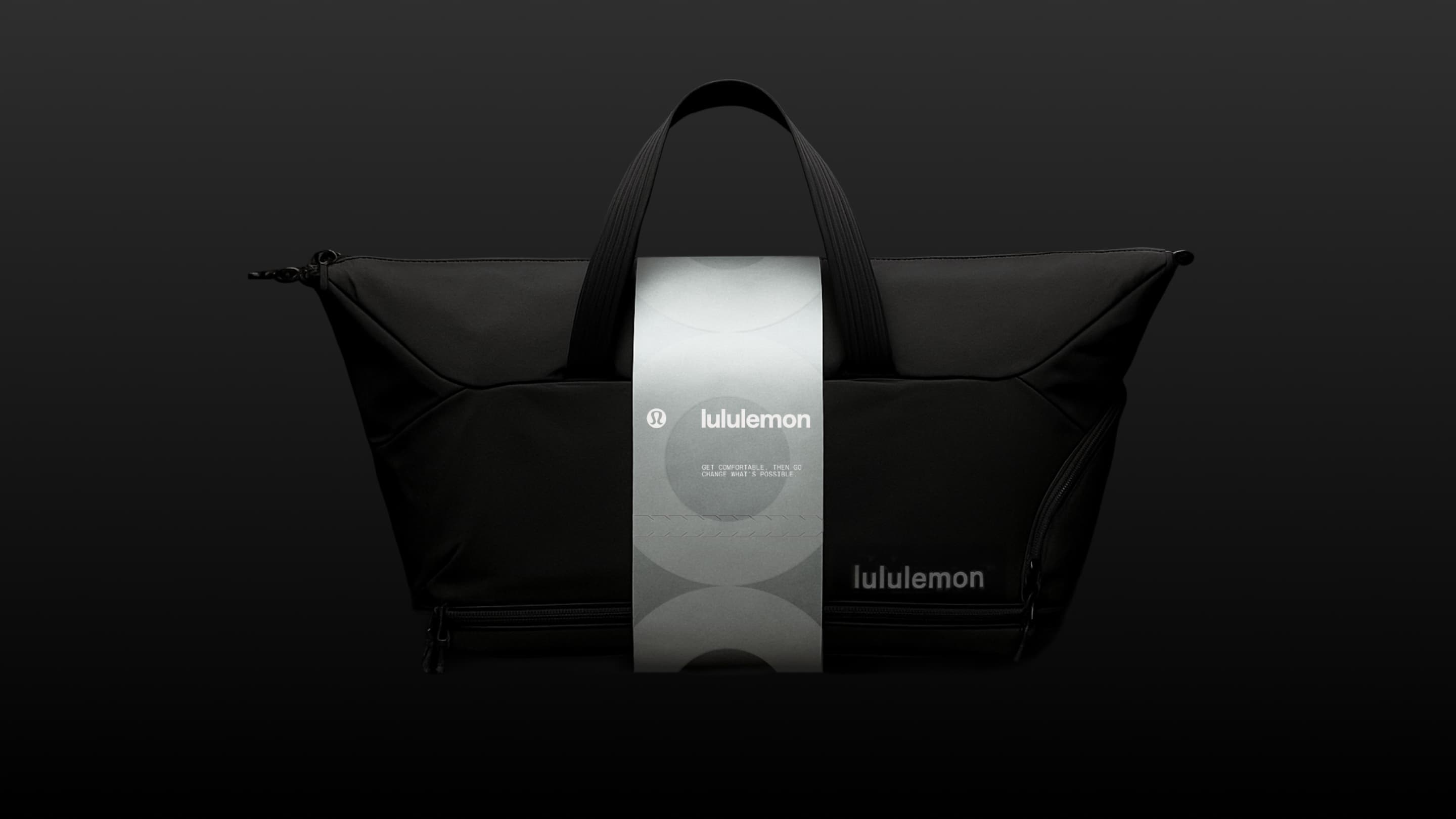
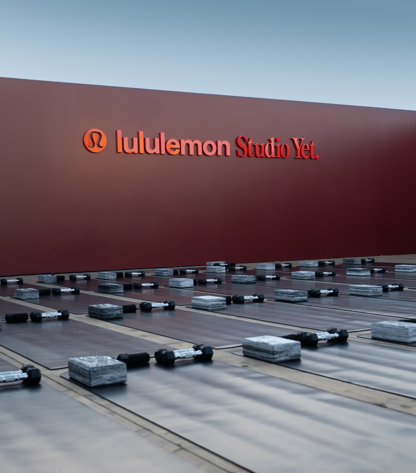
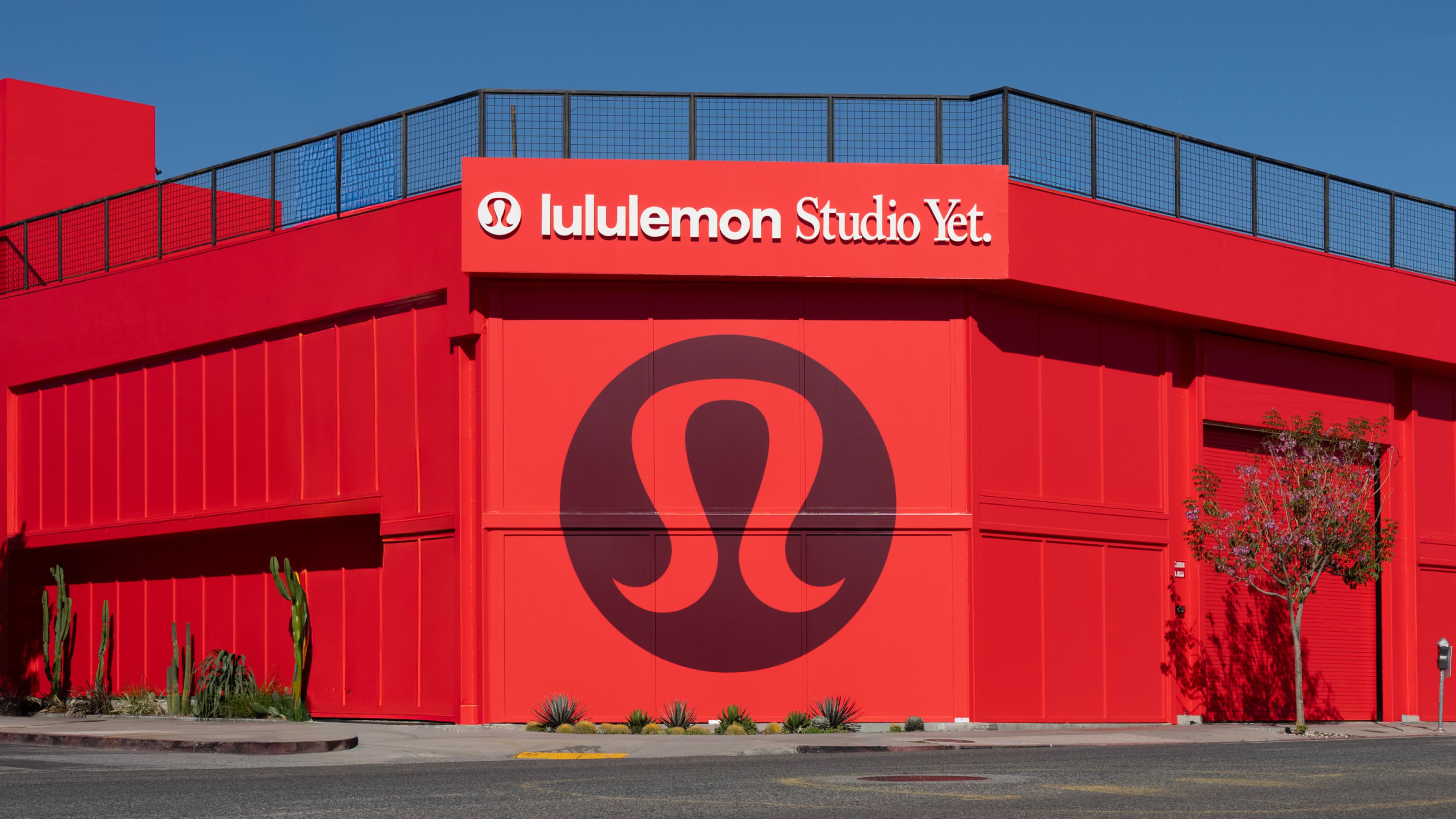
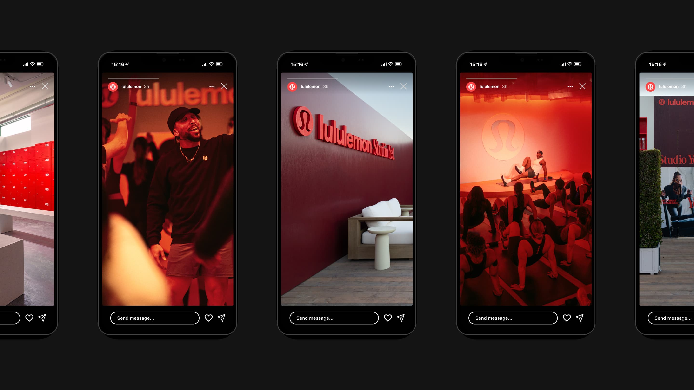
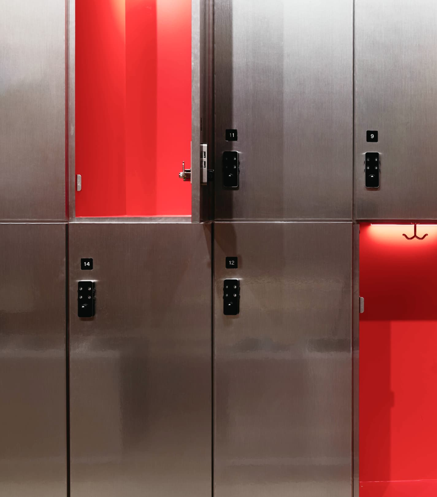
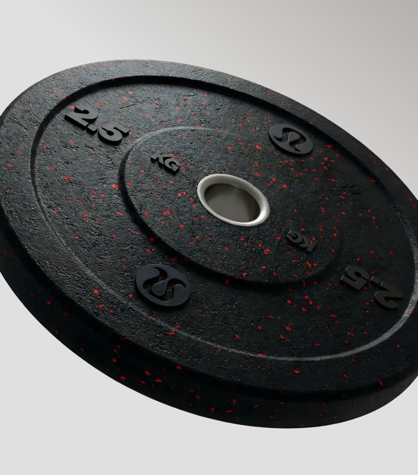
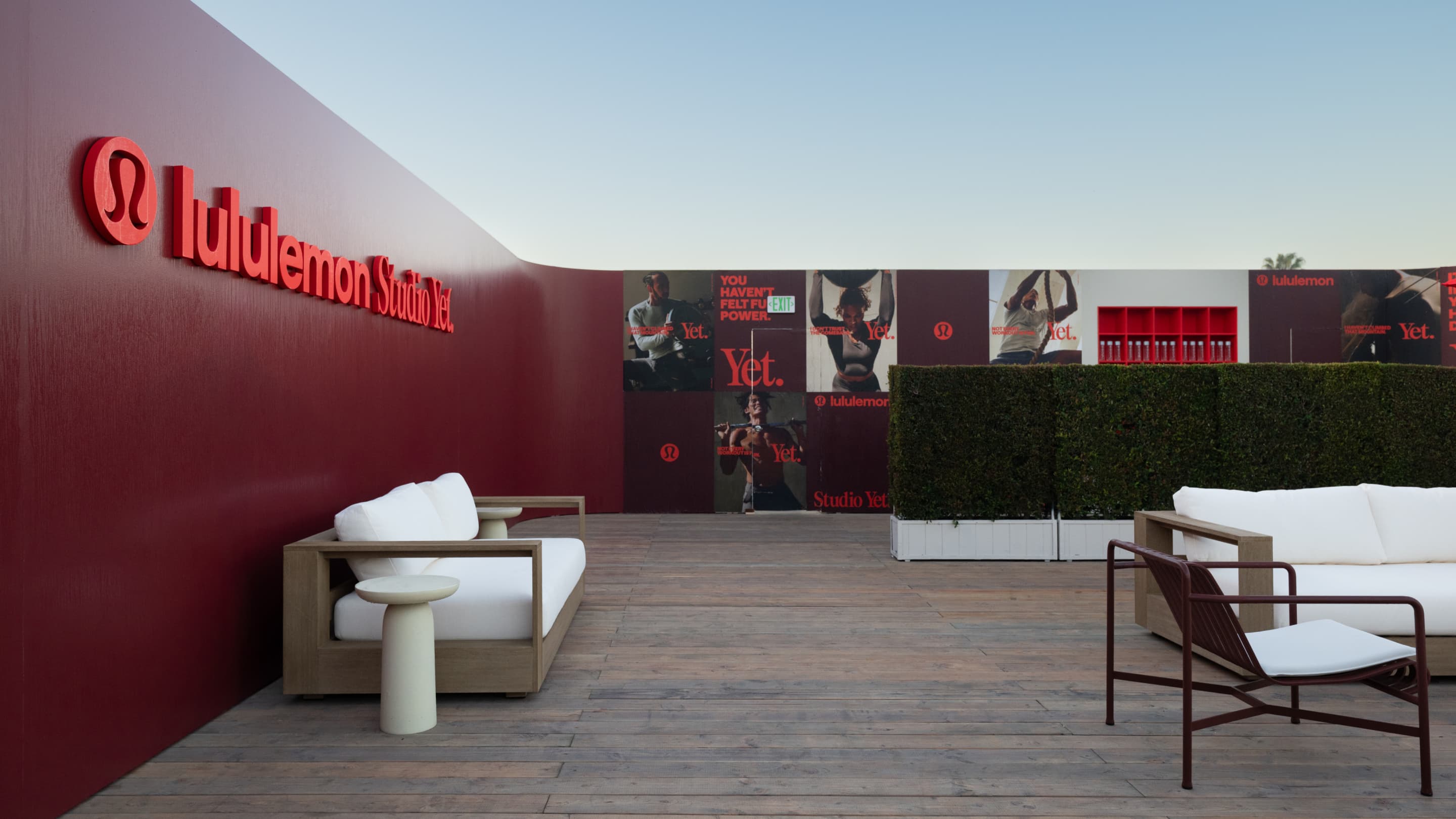
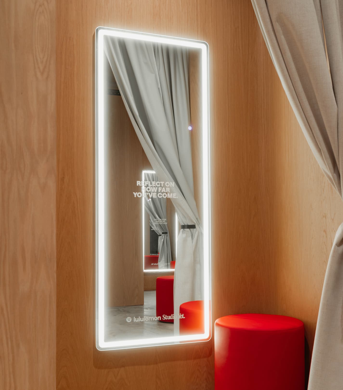
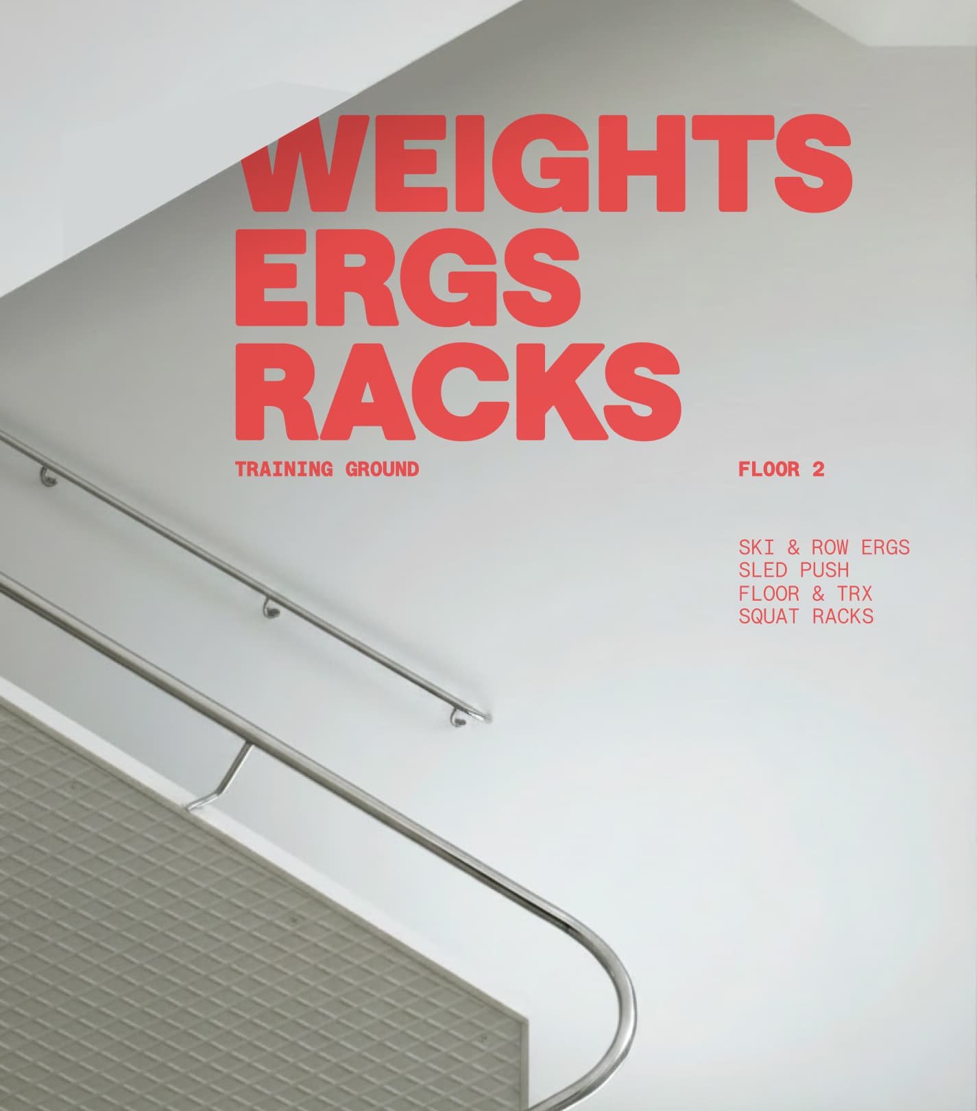
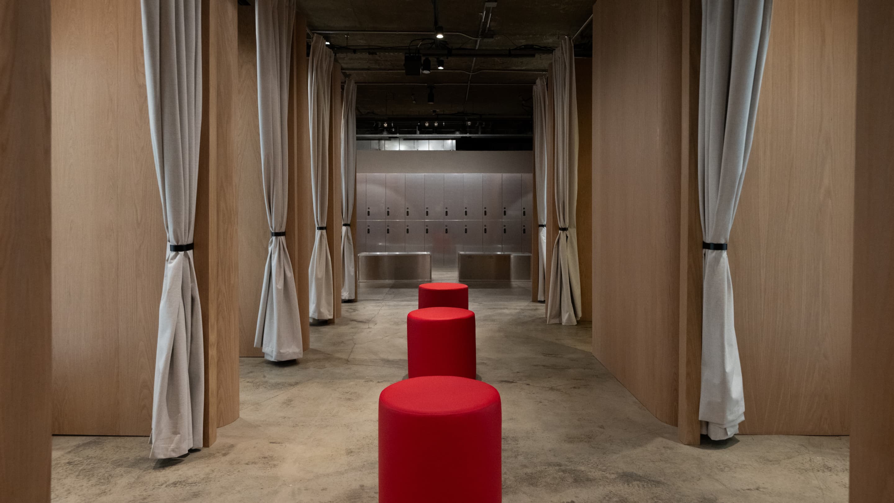
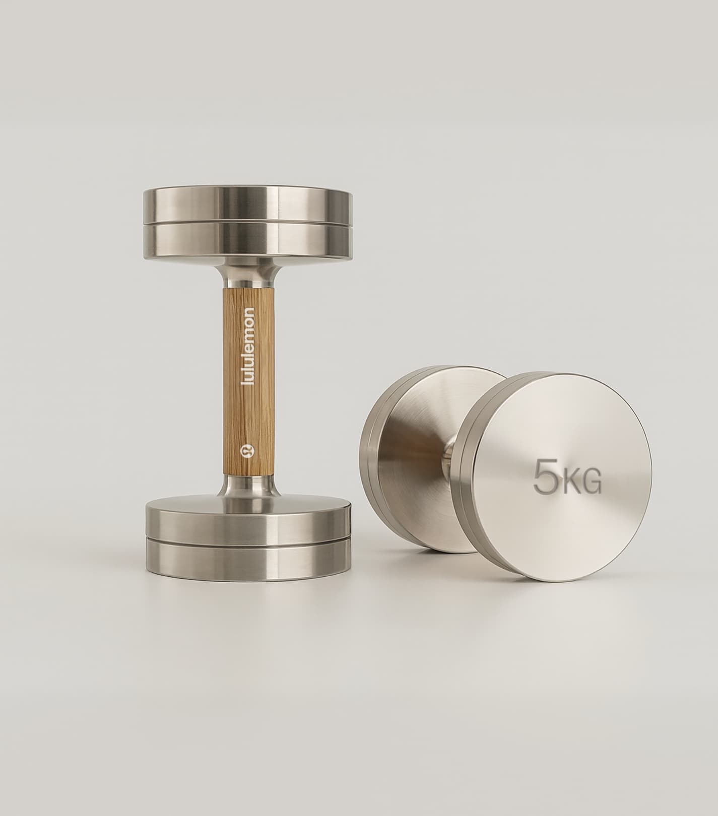
The identity brought its way into physical environments such as the Lululemon Studio Yet activation in LA. The visual system adapted across environmental graphics, signage, apparel, digital content and event materials, with gradients, patterns and motion cues creating a continuous sense of momentum throughout the space. The idea became spatial, with zones for effort, recovery and repetition that guide how people move through the experience with retail and digital channels adapting the same logic.
Studio NARI team
Caterina Bianchini
Executive Creative Director
Chloe Legret
Design Director
Design Lead
Designer
Designer
Motion Designer
Motion Designer
Project Manager
Client team
Ravi Hampole
Kat Gutierrez
Nicholas Livingston
Ibrahem Hasan
George Edge