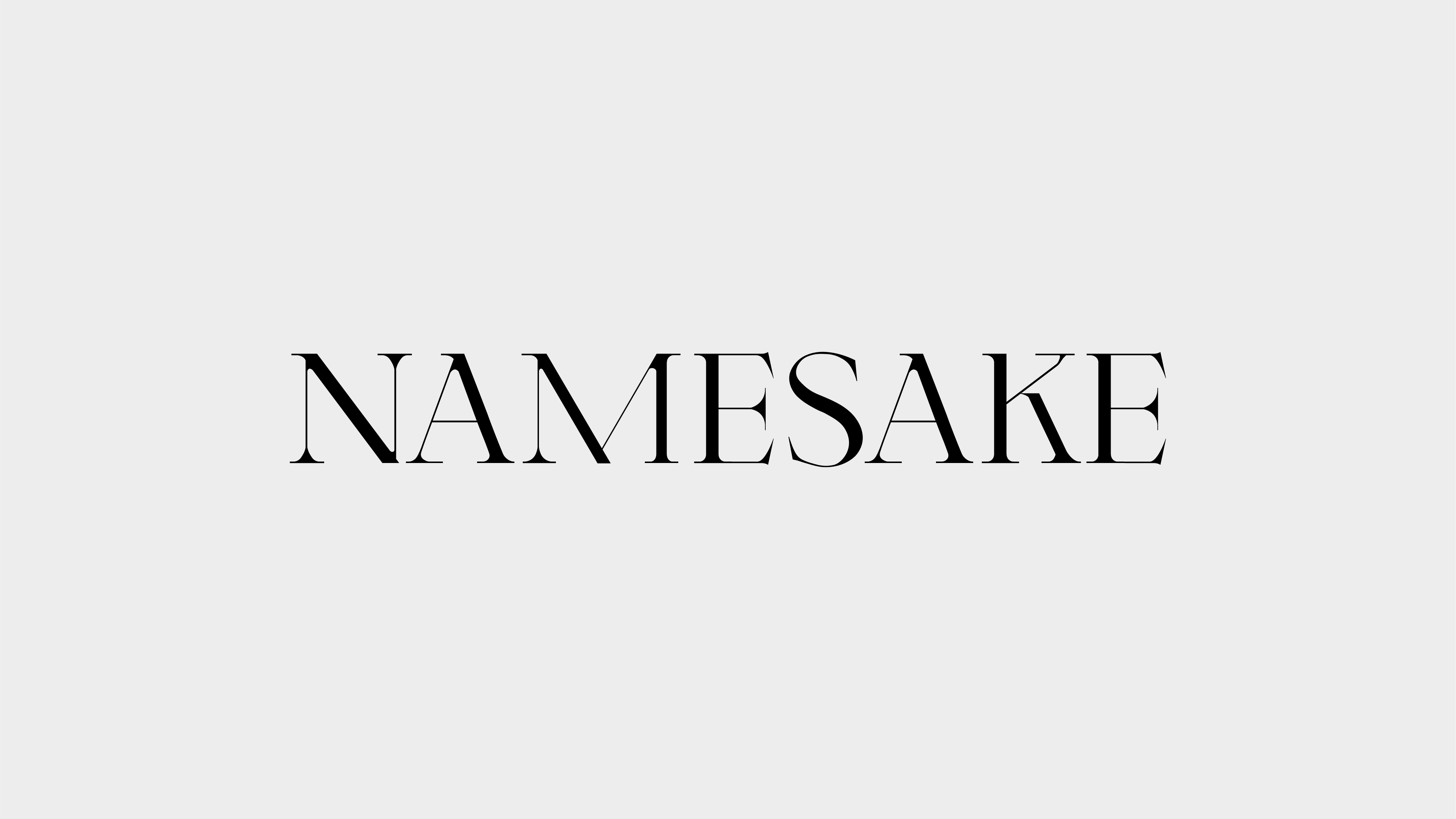
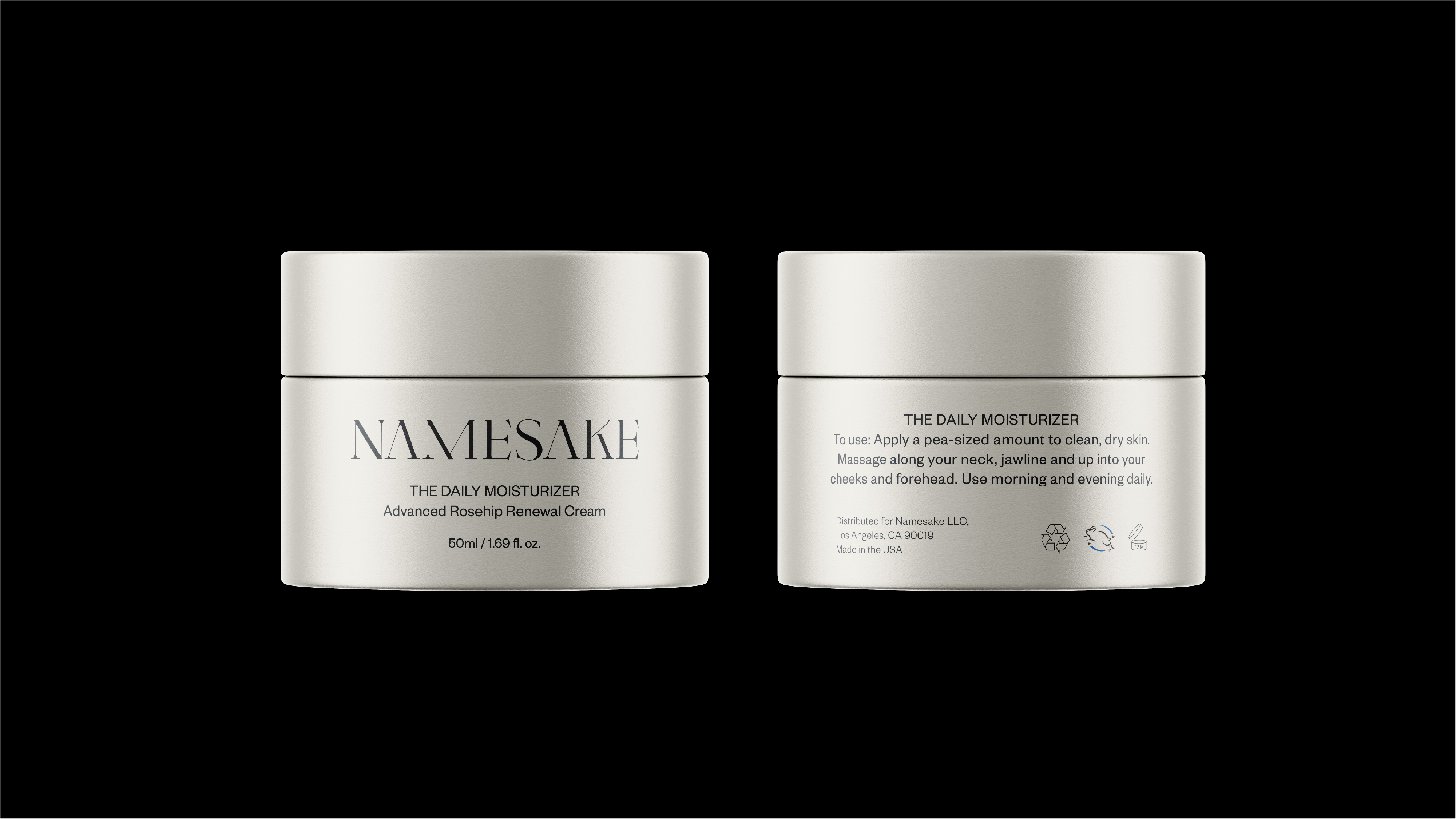
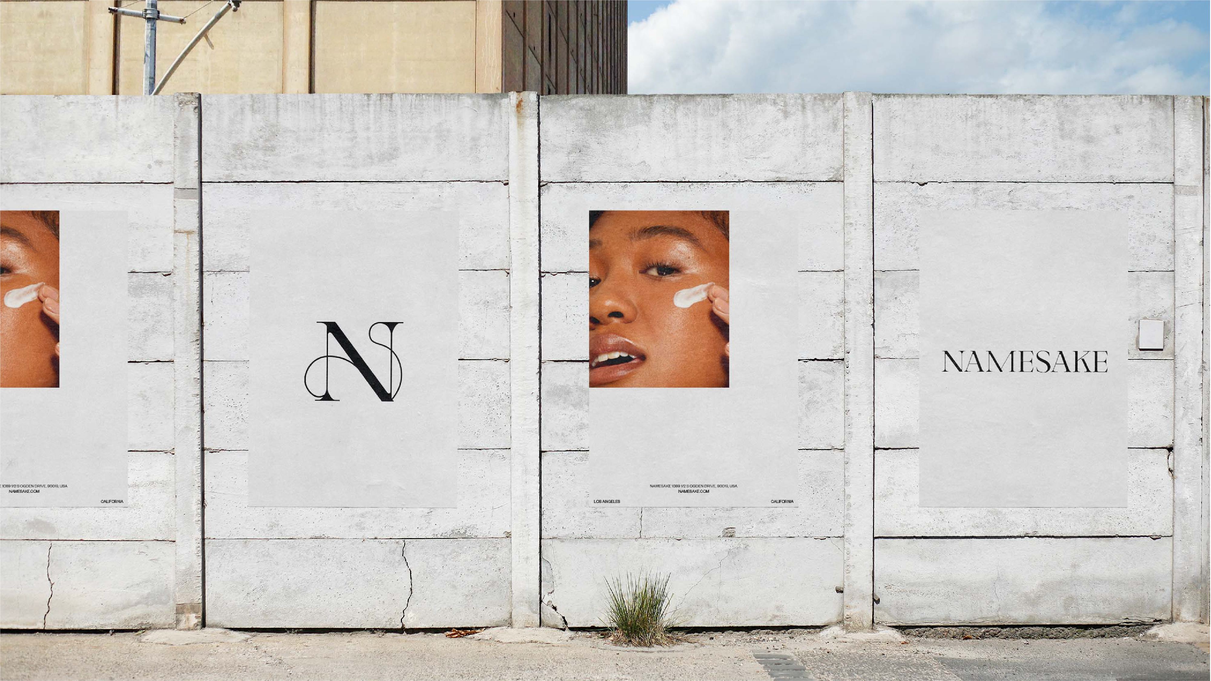
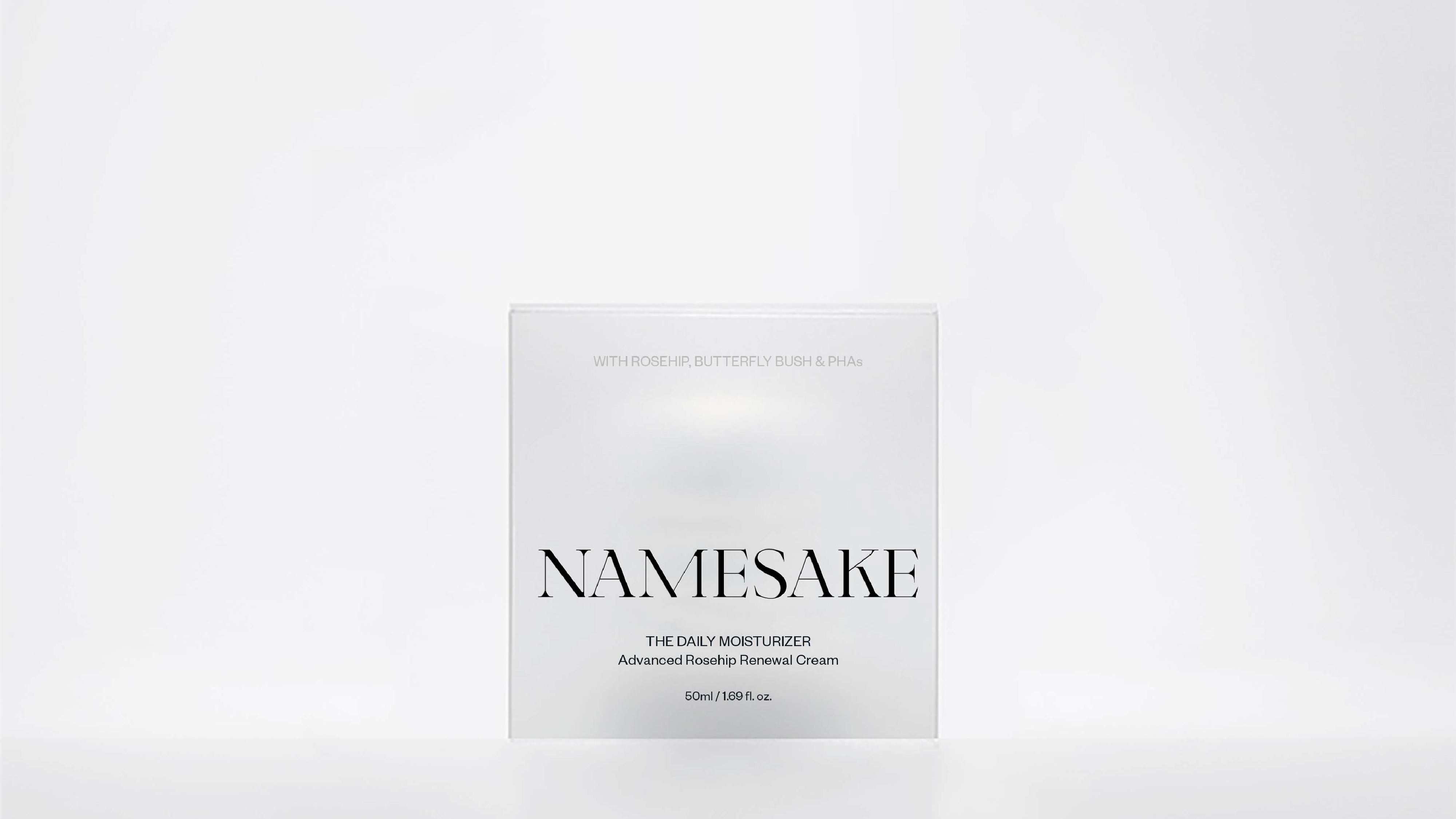
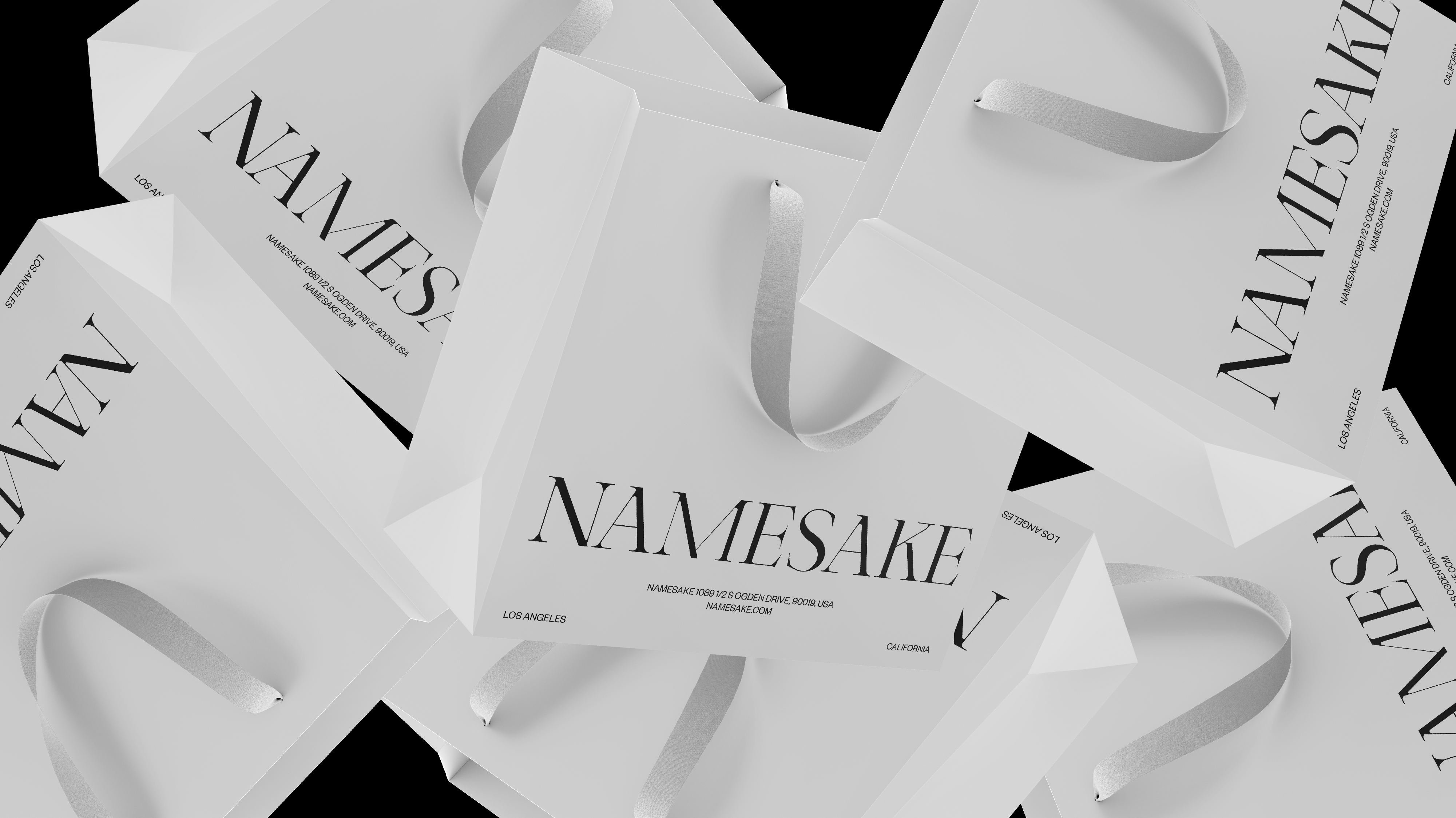
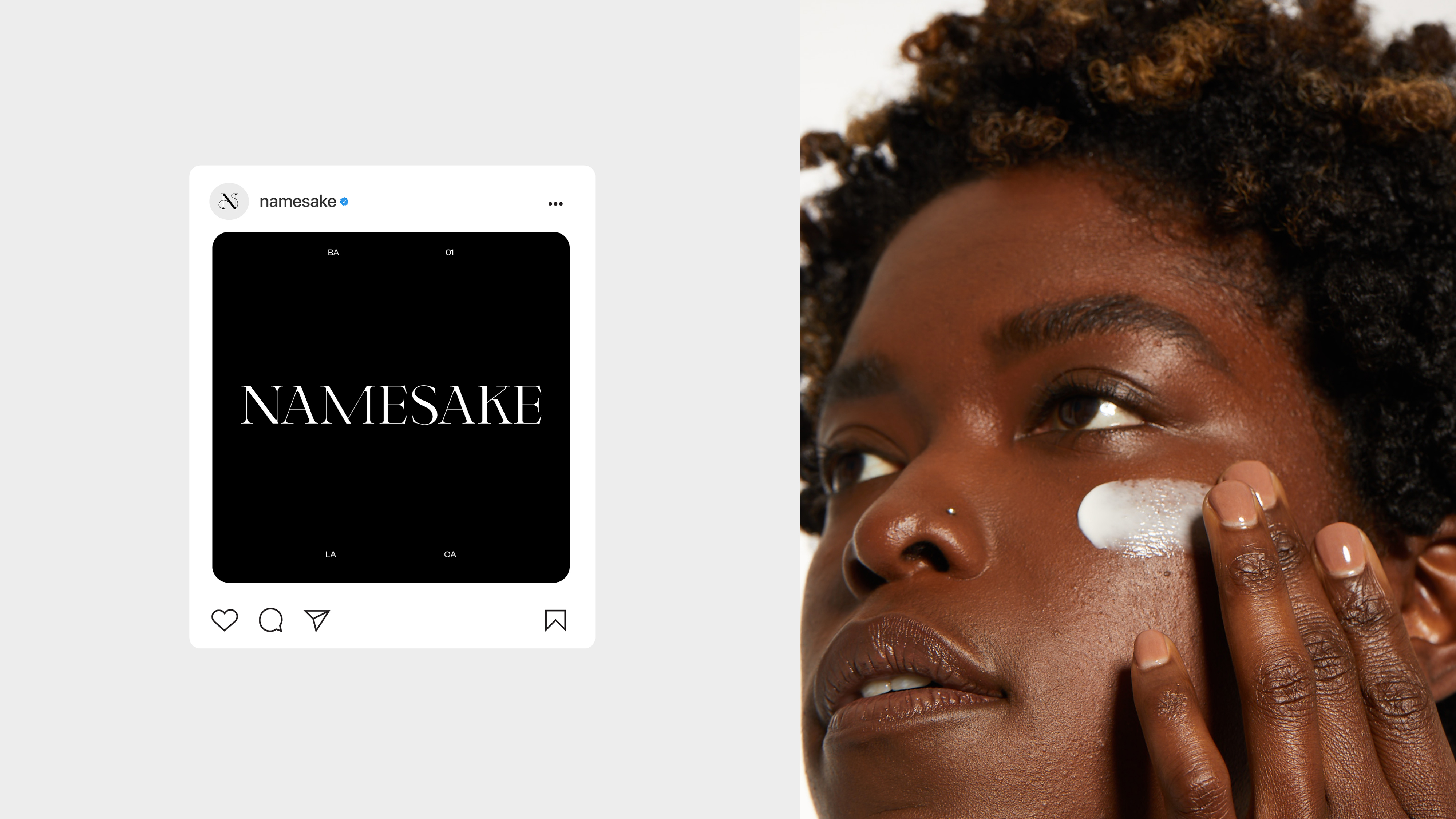
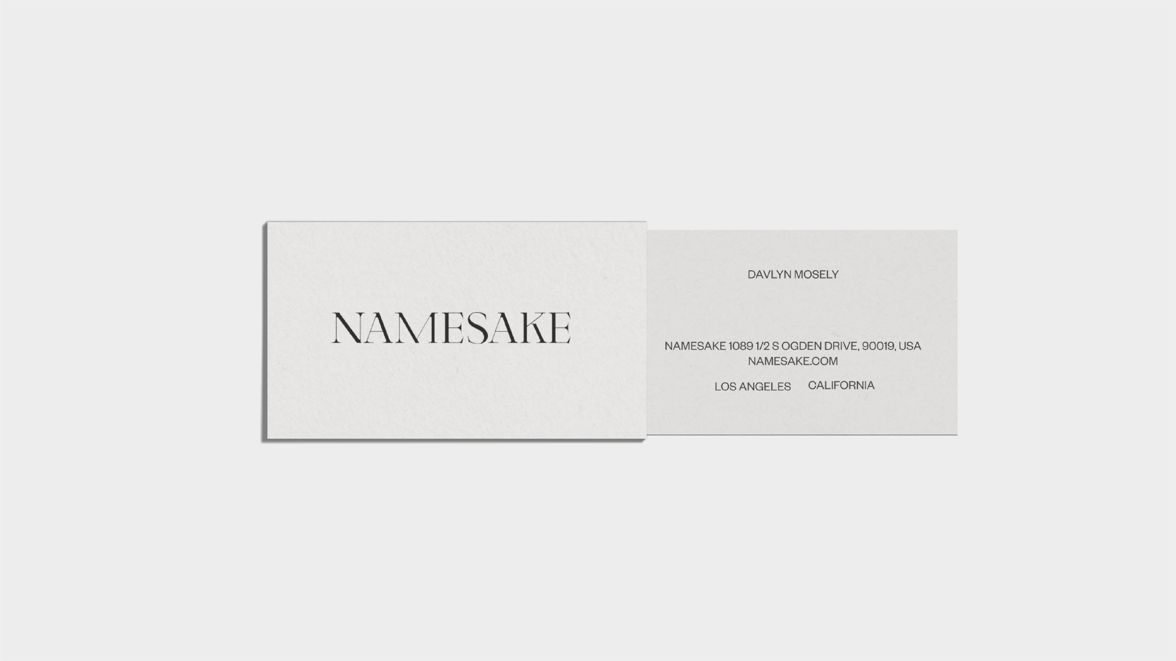
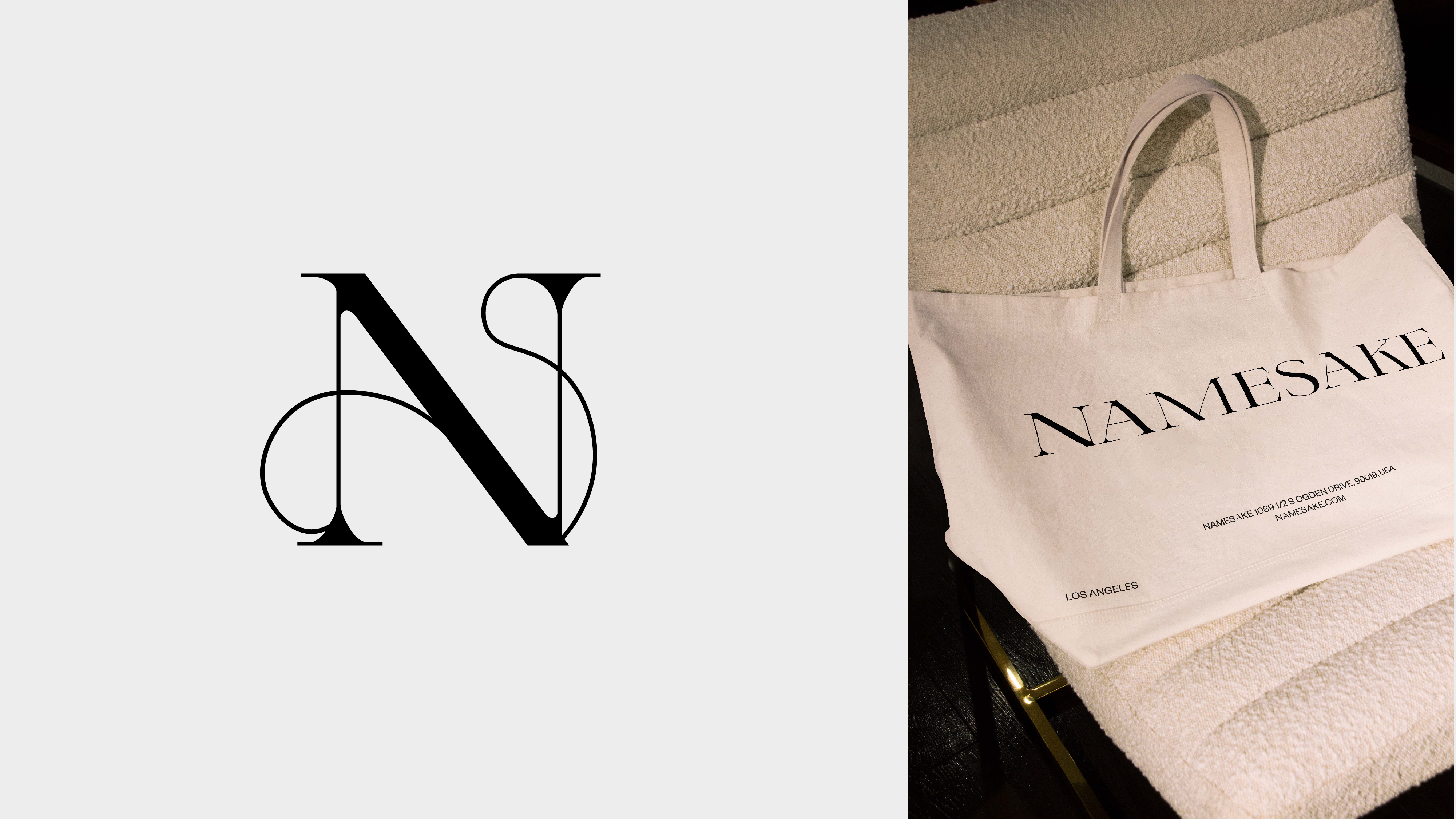
Namesake It's all in the name - An identity for a concept passed from mother to daughter 2022

We partnered with Los Angeles based Namesake to define a visual identity that represented and advocated the radical simplicity of a one step beauty regime. A concept passed from a dermatologist mother to daughter.

The logotype was drawn to feel clean, with sharp edges and elongated characters. This represented the idea of a stripped back beauty regime. We then further integrated the use of a small repeated graphic motif in each of the characters to create a link between each of them - representing the bond between mother and daughter and the inception of Namesake. The mark mimicked an almost ‘Coat of Arms’ aesthetic, further channeling the brand story and heritage.