Transforming functional energy into a culturally relevant brand
Context
The energy drink category has long been defined by artificial intensity and performance culture. At the same time, a growing audience was seeking energy that felt cleaner, more balanced and better aligned with how they actually live. Tenzing had the product to answer that shift, but the brand lacked the clarity and cultural presence to convert awareness into growth. Outside the cans there was little brand world to recognise or believe in. The challenge was to build a brand that could compete with mainstream energy while staying true to a healthier point of view.

Unlock
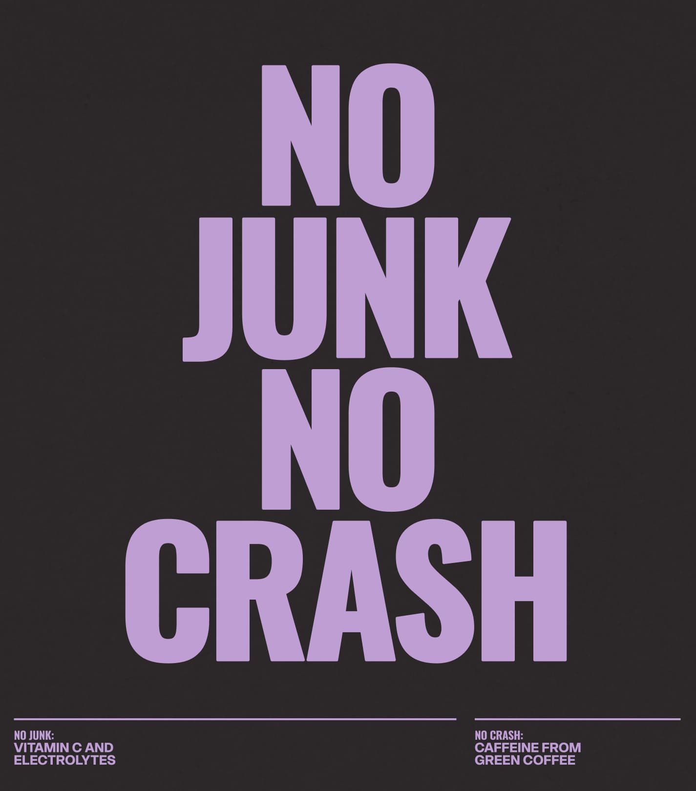
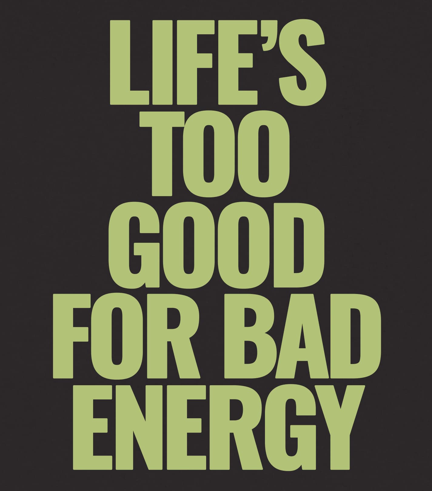
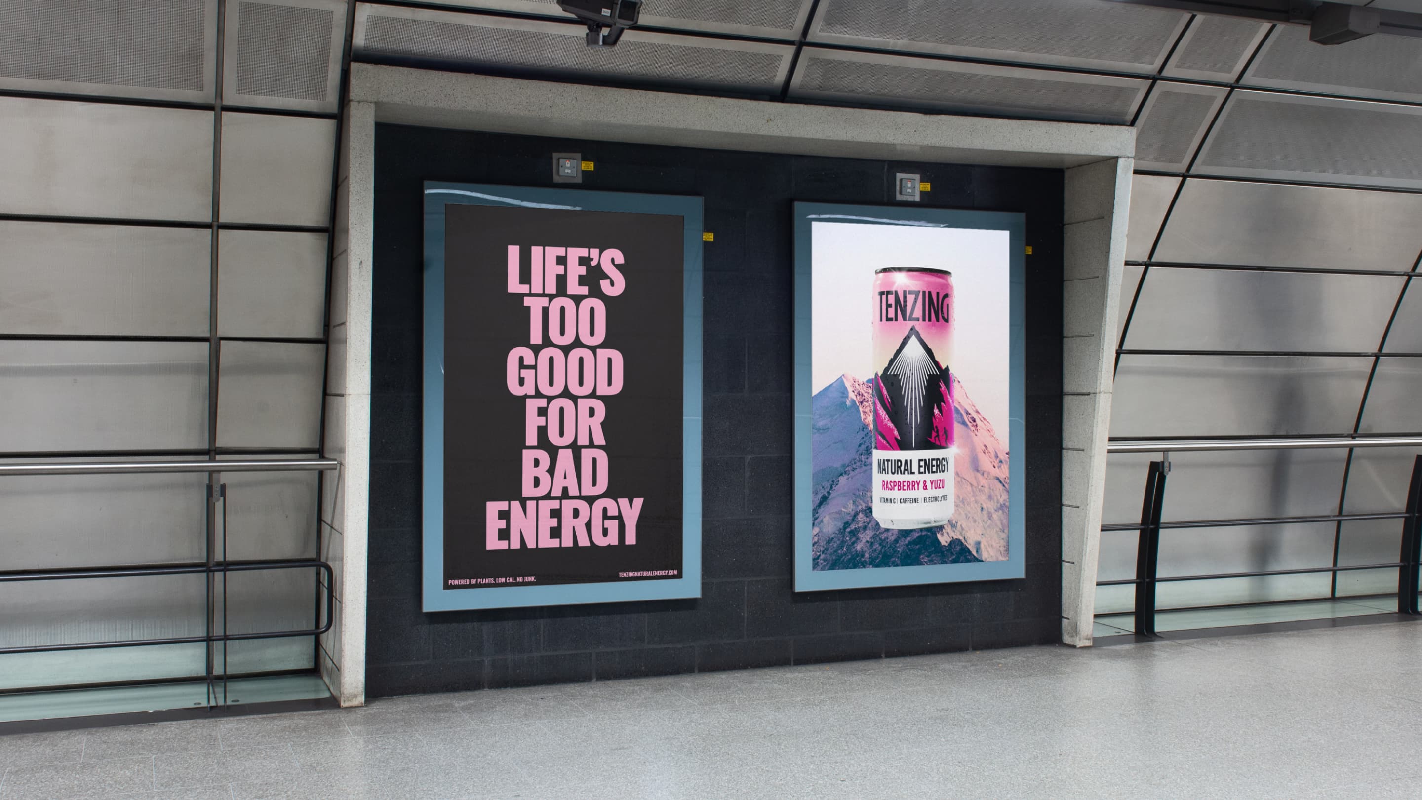
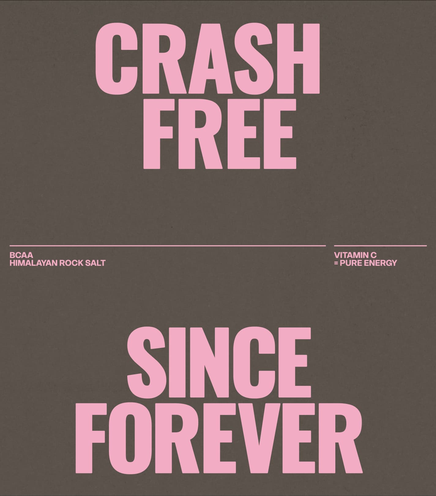
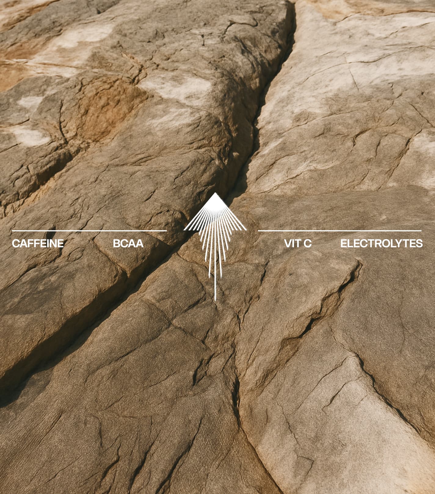
Energy as a category promise had become synonymous with artificial intensity. 'Good Energy' collapsed product function and emotional benefit into a single, usable belief. It works because it explains both what the drink does and how it should feel, removing the need for heavy ingredient education. The brand rewards vitality, momentum and connection while resisting the artificial hype and performance signalling that dominate the category. Energy is no longer positioned as something aggressive or synthetic, but as something people carry, share and sustain.
Create
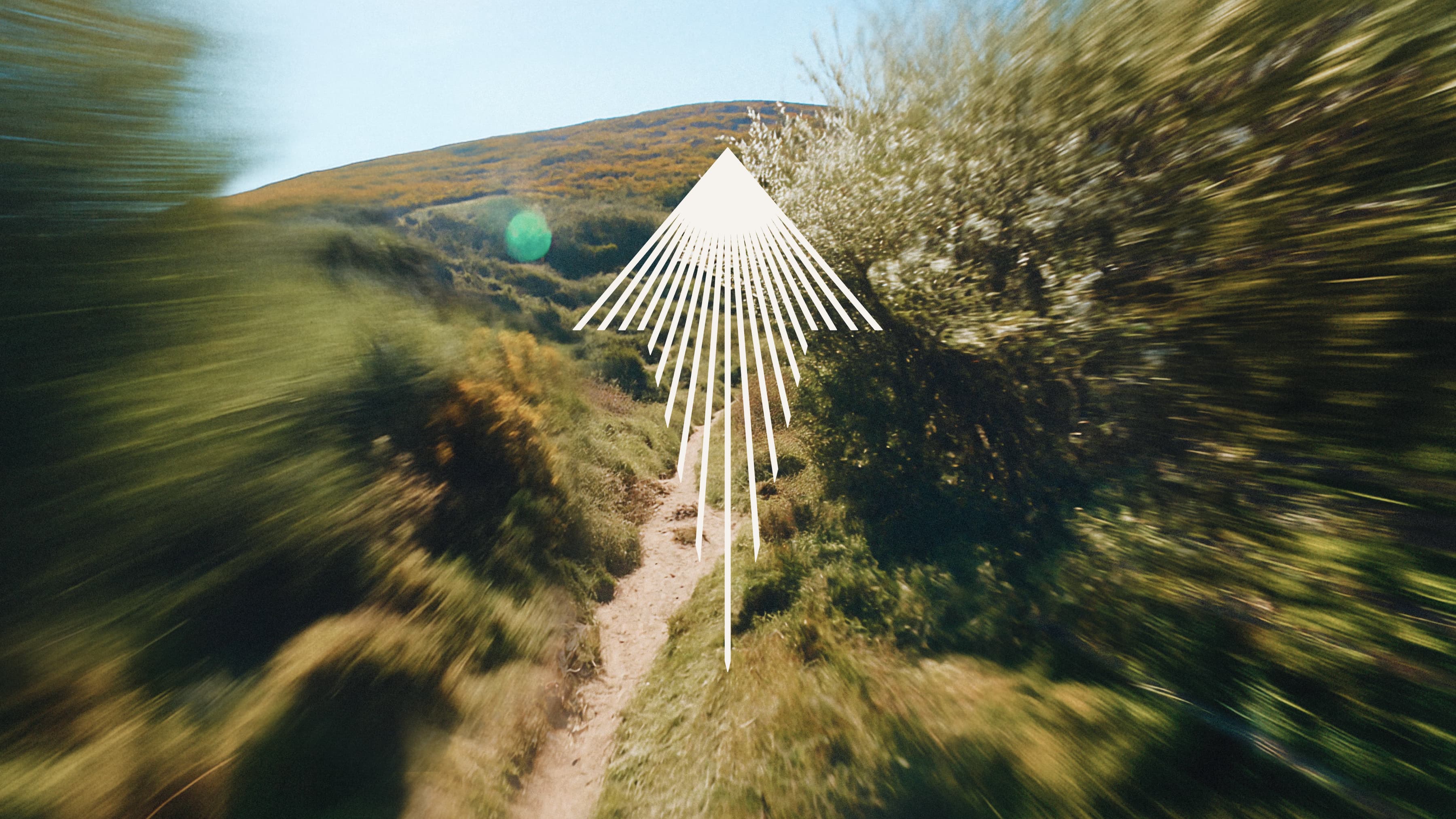
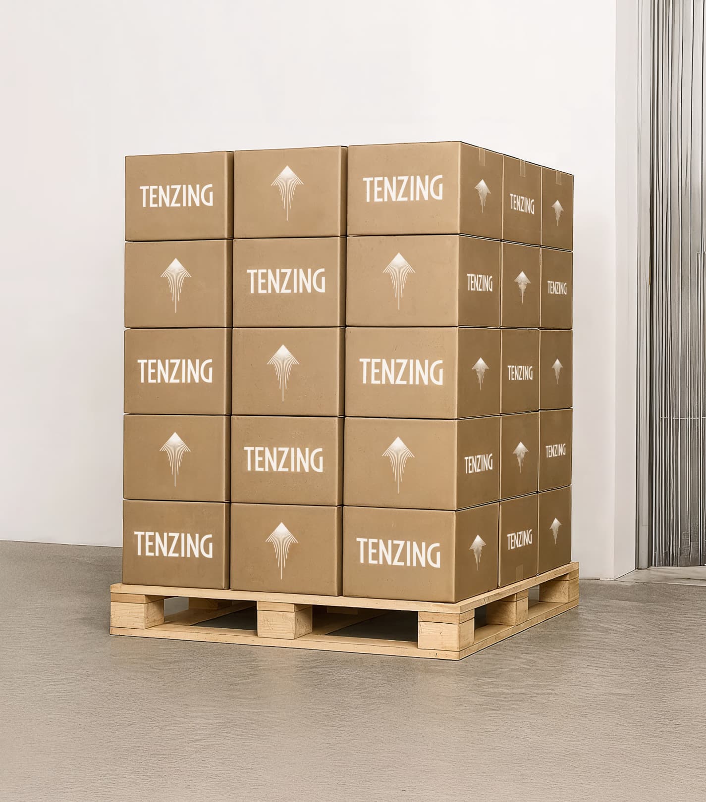
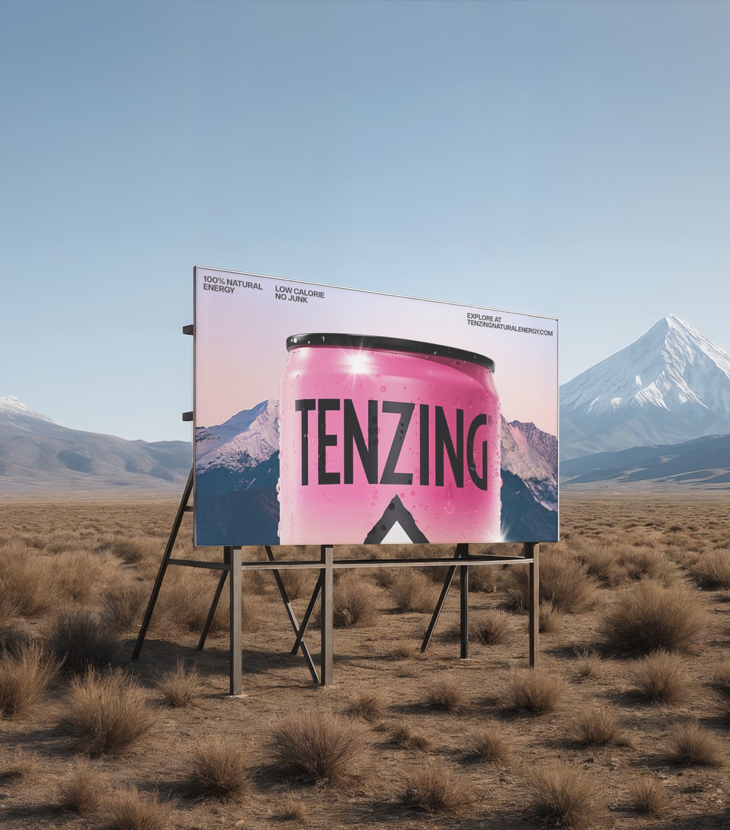
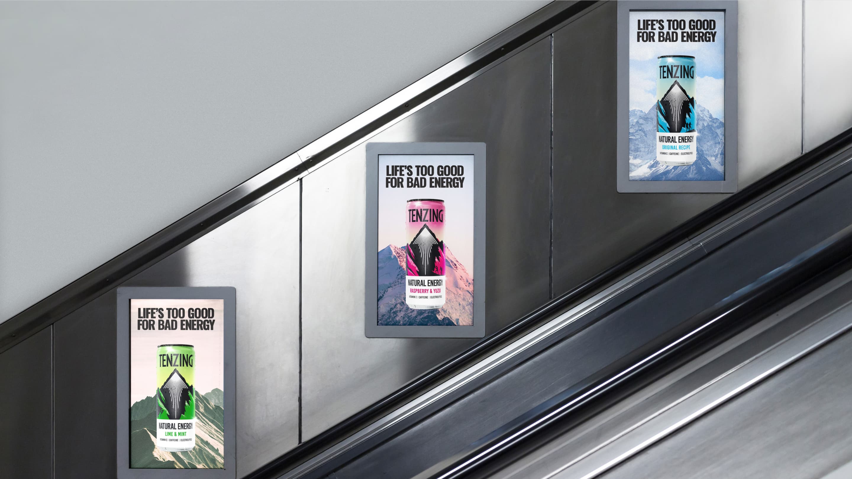
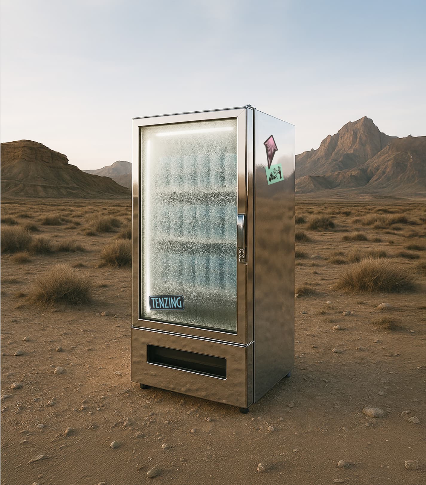
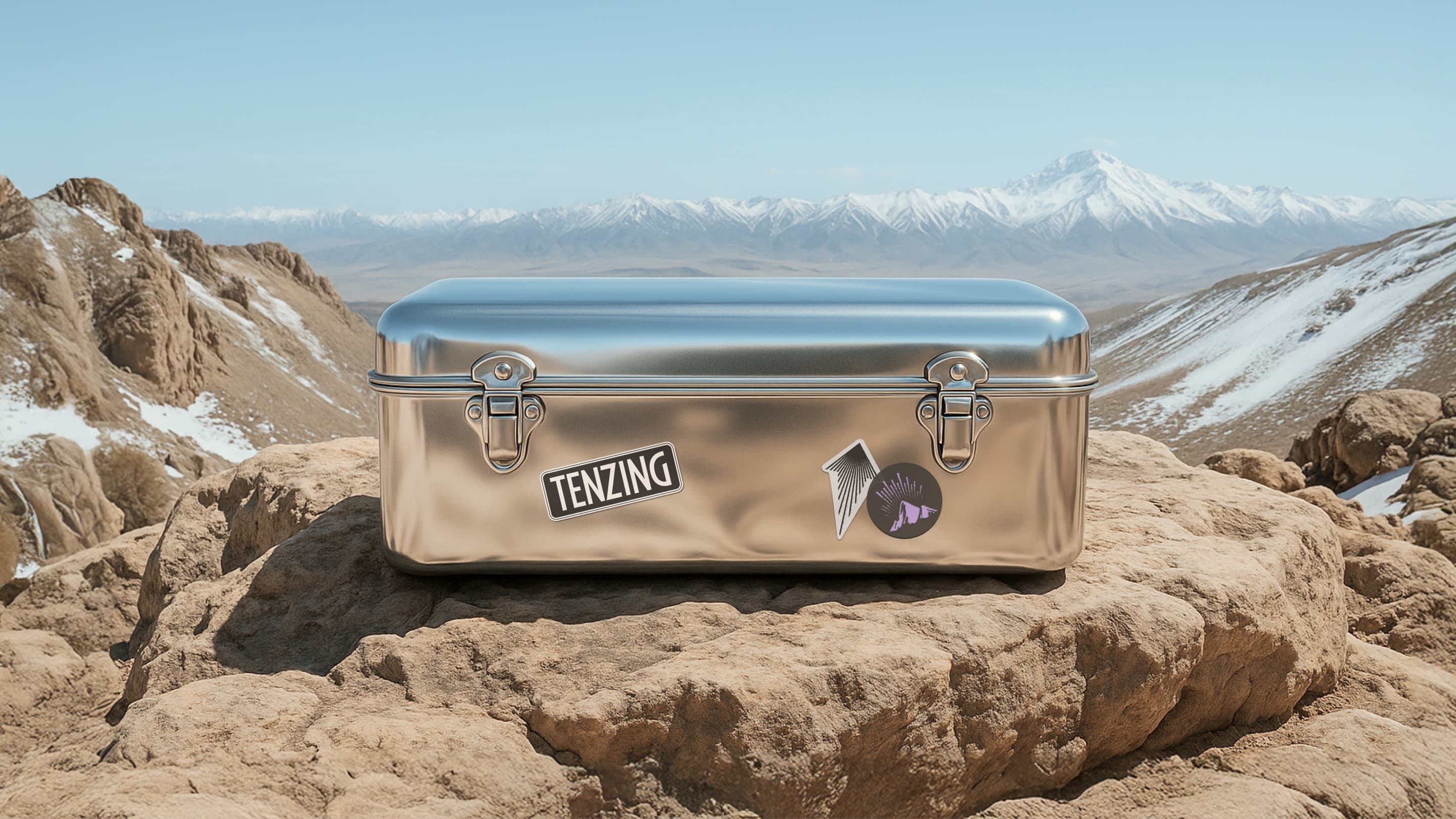
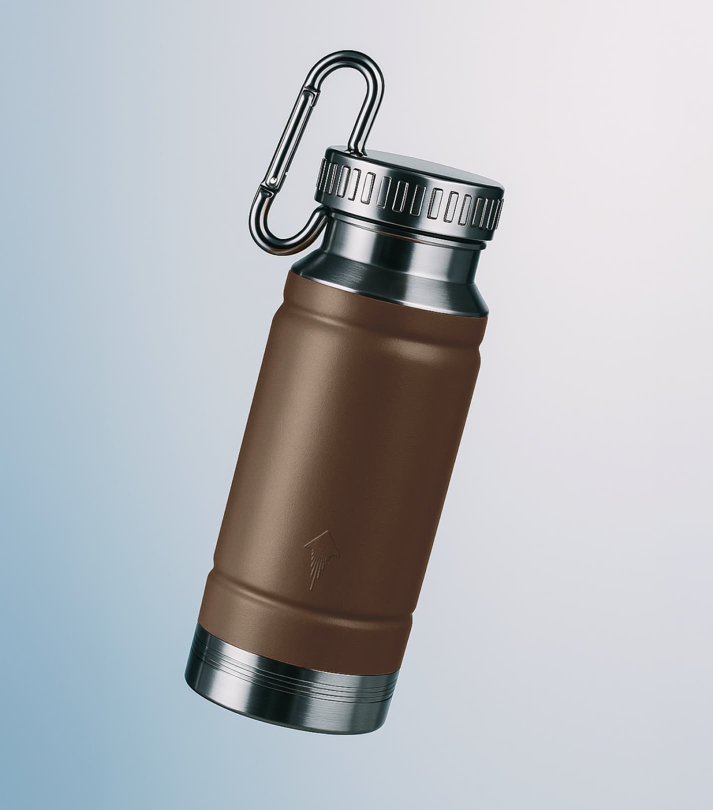
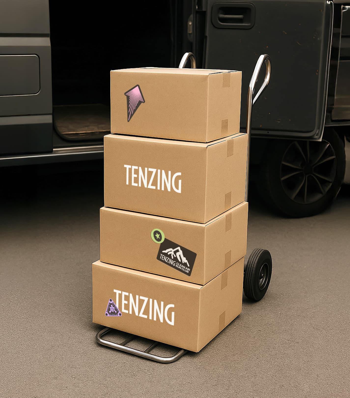
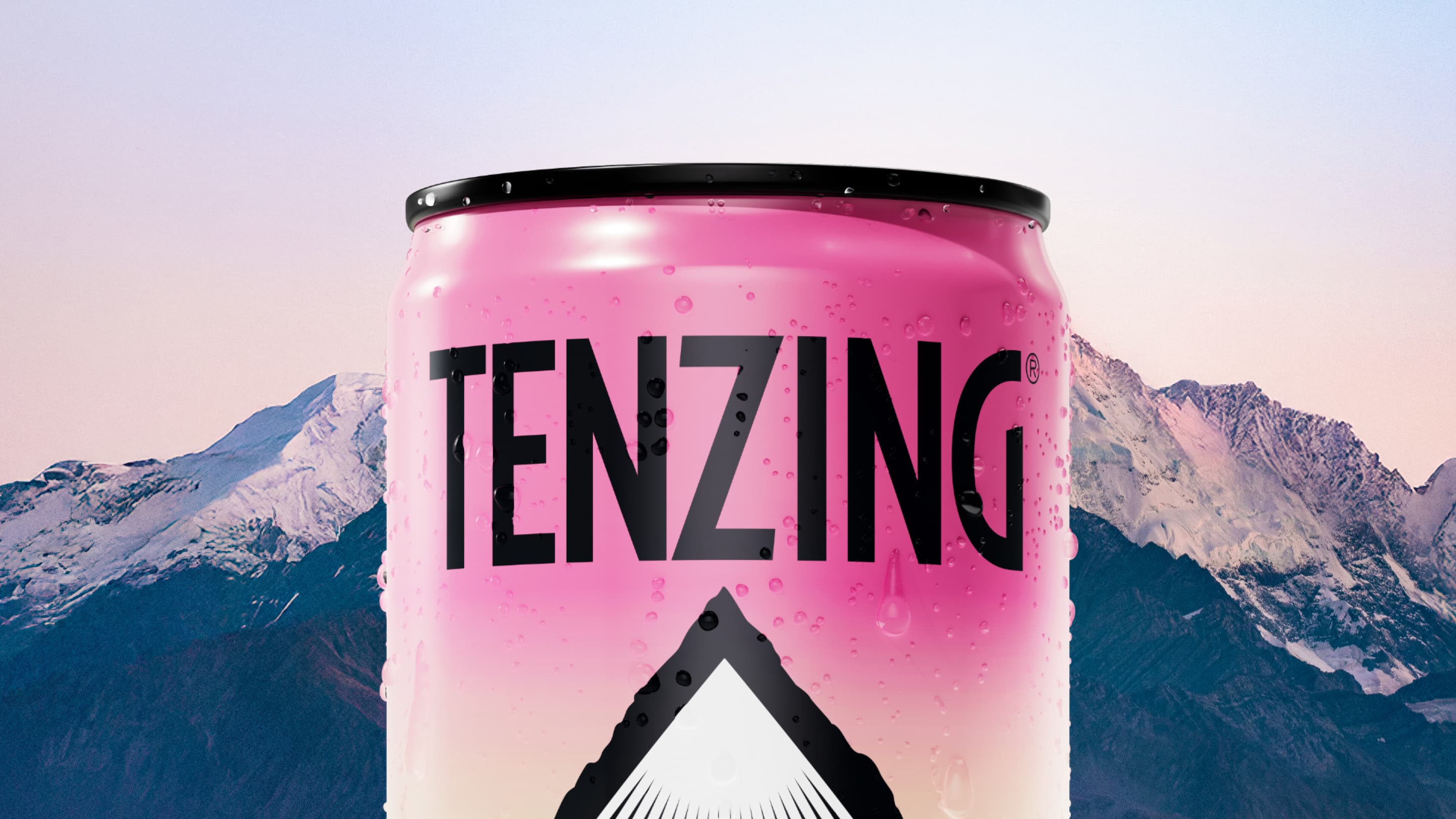
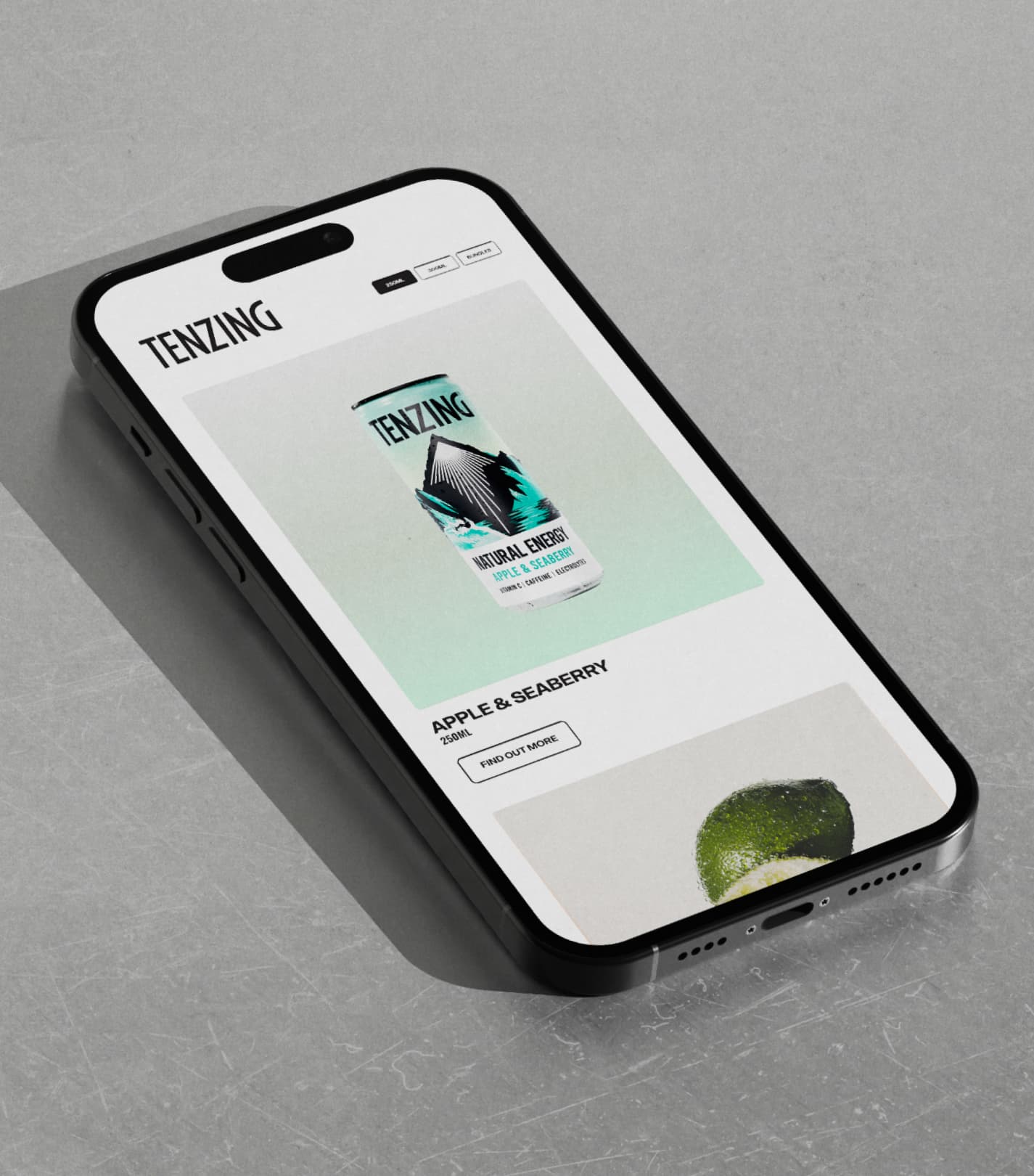
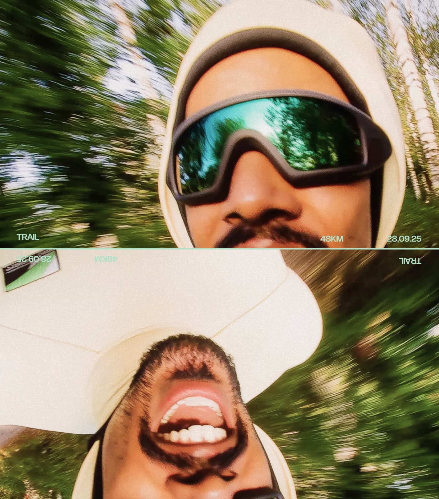
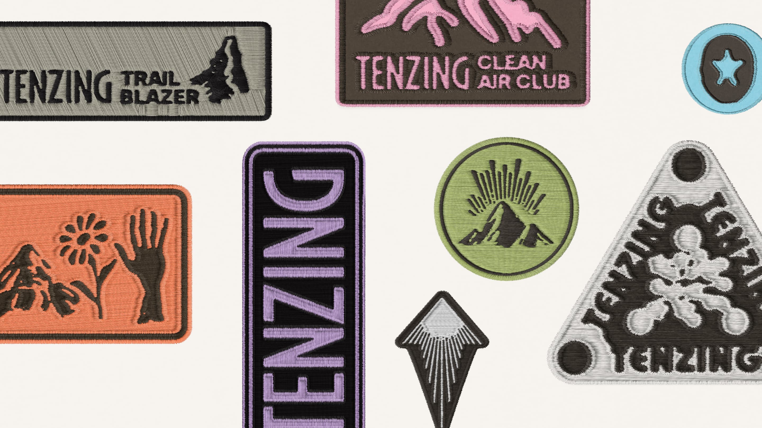
The brand was built to express this shift with clarity and warmth. Language moved away from technical ingredient explanation toward simple, human statements about energy and how it moves through everyday life. A coherent brand world extended beyond the cans so the product could operate culturally as well as functionally. Tone, typography and visual structure prioritised legibility and optimism, signalling confidence rather than craft-led niche cues. Toolkits were designed to scale across retail, campaign and digital environments so the idea of Good Energy could operate consistently wherever the brand appears.


Become
The system behaves as a living platform rather than a static identity. In retail it clarifies the offer and makes the product’s energy credentials immediately legible. In campaigns it dramatises energy as a positive force in people’s lives, moving through culture, community and everyday momentum. The strategic idea remains fixed, while creative expression flexes across channels and moments. This allows TENZING to operate across retail media, digital communication and brand campaigns without losing coherence.

Unmistakably TENZING
TENZING now stands apart as the energy brand built around how energy should feel, not just how it is chemically delivered. The category remains dominated by artificial intensity or niche wellness cues, leaving little space for a brand that is both culturally warm and functionally credible. By claiming Good Energy as its organising principle, TENZING occupies a position that competitors cannot easily replicate without abandoning their own category codes. The brand is recognised not just for its product but for the kind of energy it represents.
Strategic Scope
Brand Strategy & Positioning
Brand Framework Development
Audience & Cultural Insight
Creative Scope
Brand Identity Systems
Brand World Building
Art Direction & Visual Language
Motion Design & Brand Dynamics
Campaign & Digital Expression
Studio NARI team
Creative Director
Design Director
Art Director
Editor
Motion
Motion
Project Manager
Client team
CEO & Founder
Head of Marketing