A brand built from the community it represents.
Context
#YouTubeBlack started as a creator-initiated hashtag for Black creators to discover each other on the platform. When YouTube committed $100M through the Black Voices Fund, the initiative outgrew it. A hashtag cannot hold grant programs, creator development, events, awards and editorial across eight countries. The program needed a brand with the credibility of a community movement and the scale of a global platform investment.
Unlock
Corporate community programs almost always centre the corporation. The visual language defaults to the parent brand made warmer: softer palette, inclusive photography, institutional tone. NARI rejected that framing entirely. The strategic question was not how YouTube should celebrate Black creators but who the brand belongs to. The answer, the creators, drove every decision. The creative platform, Amplifying Voices, positions the identity as a mechanism for staging creator work rather than narrating corporate generosity.

Create
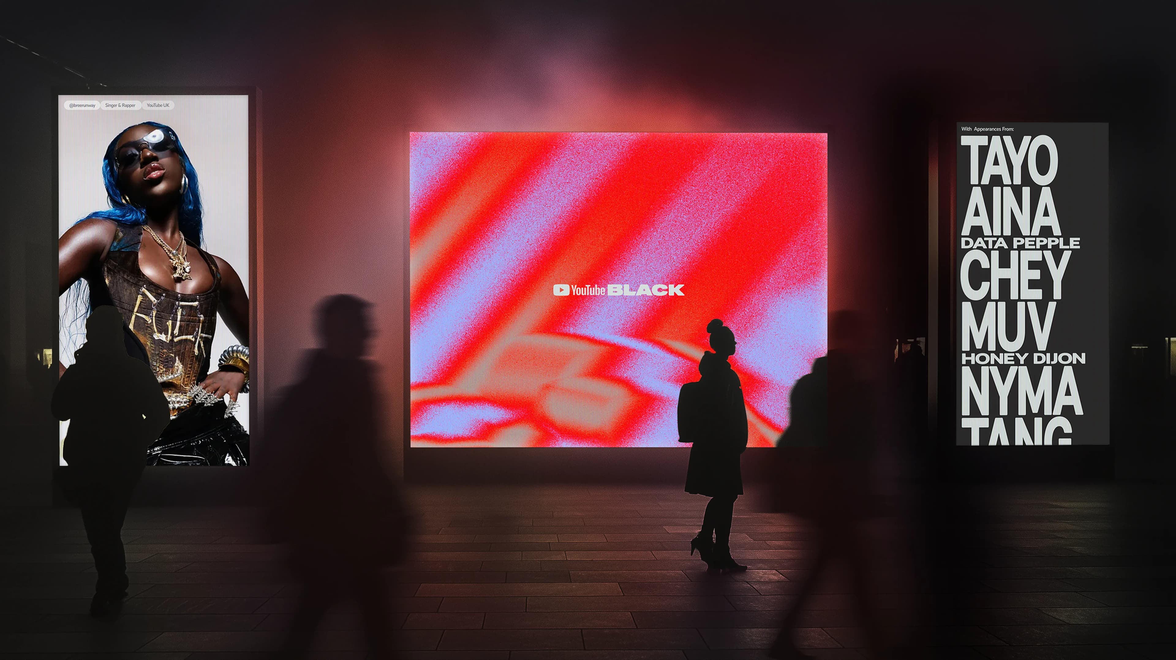
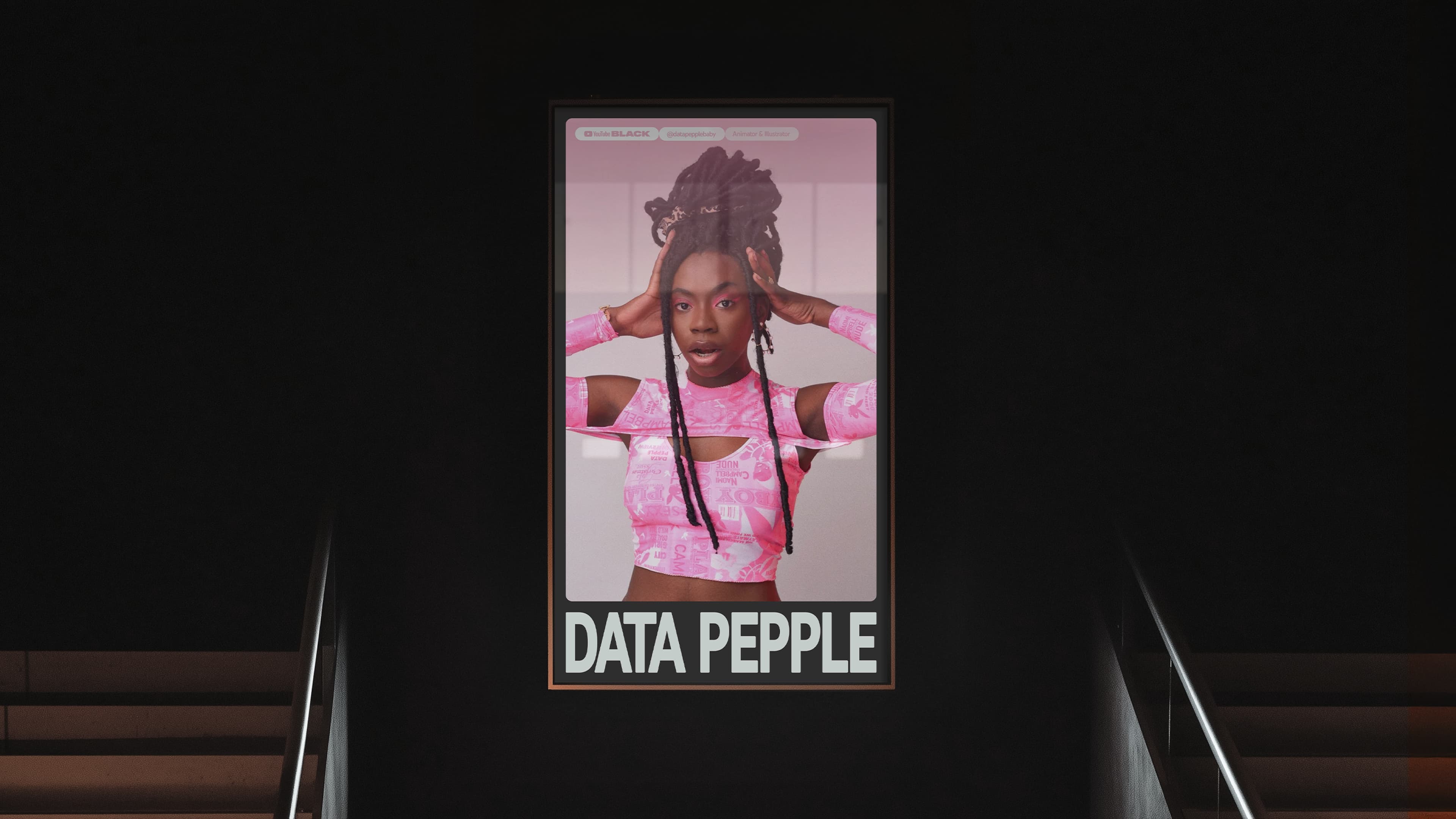
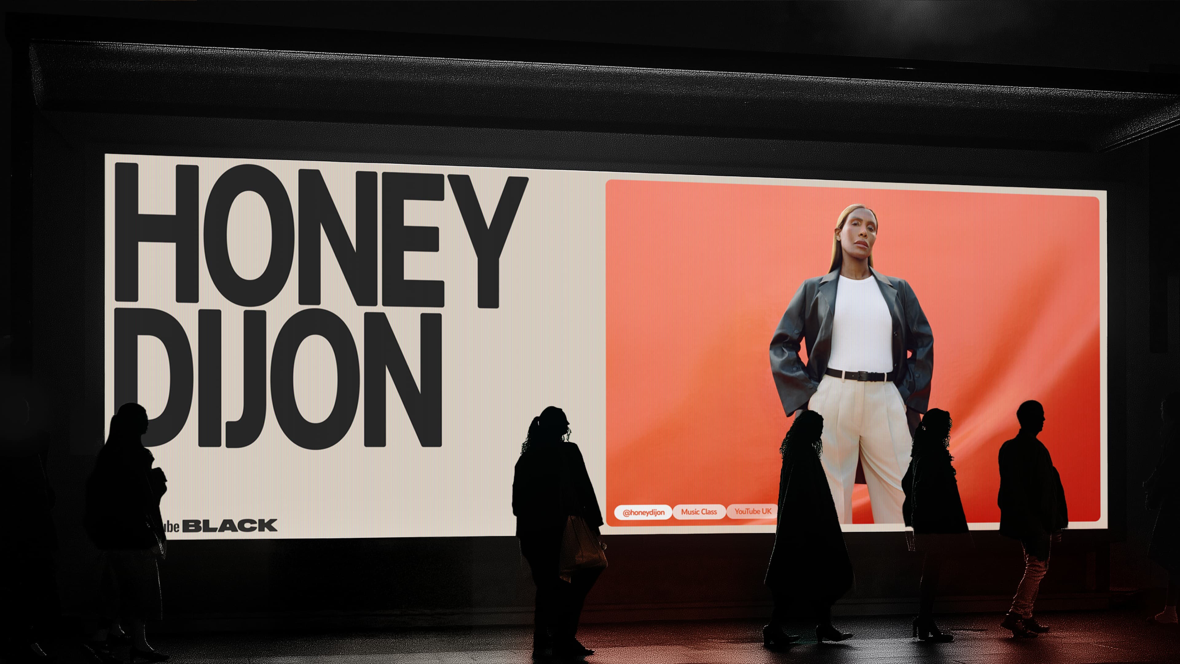
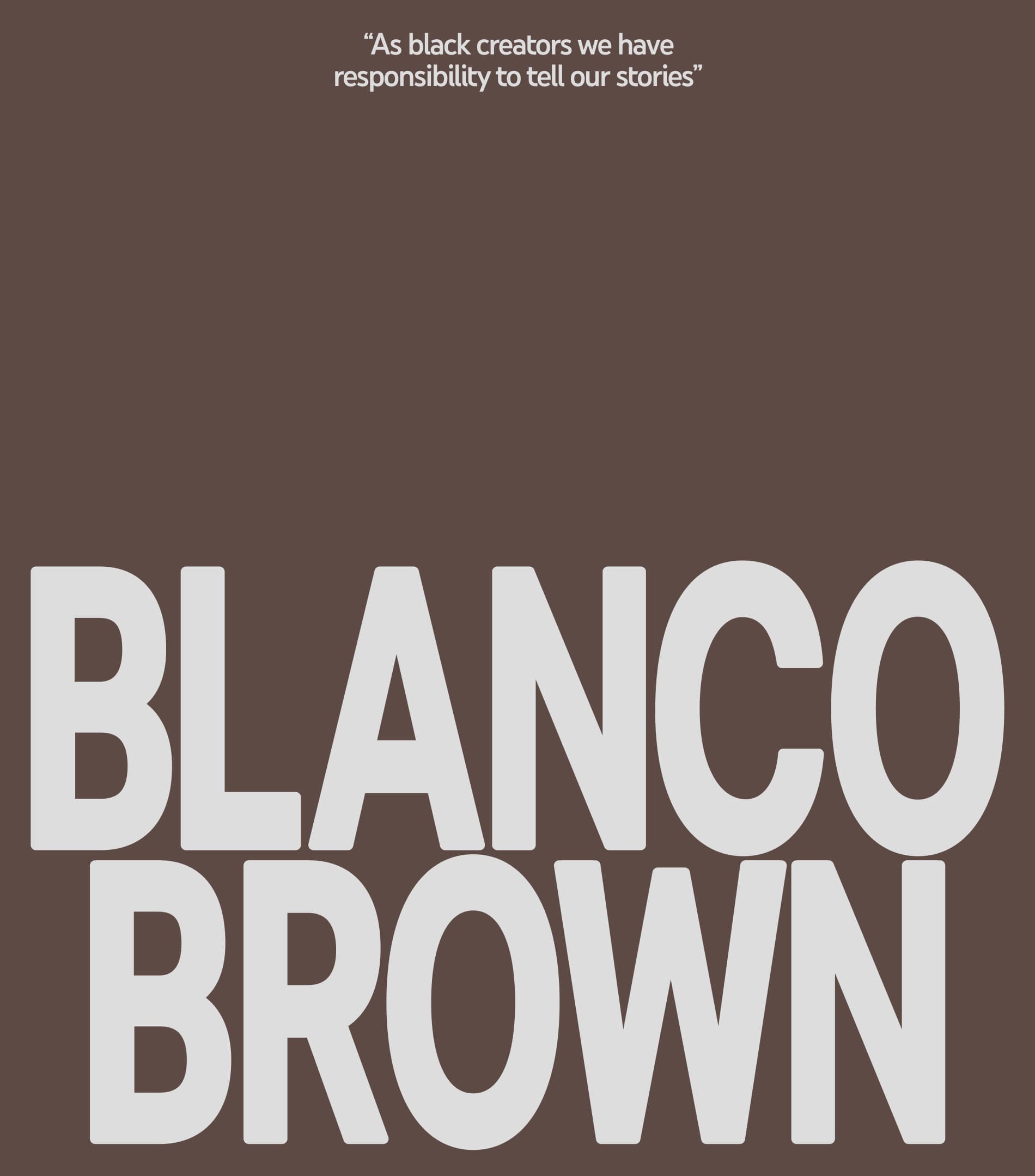
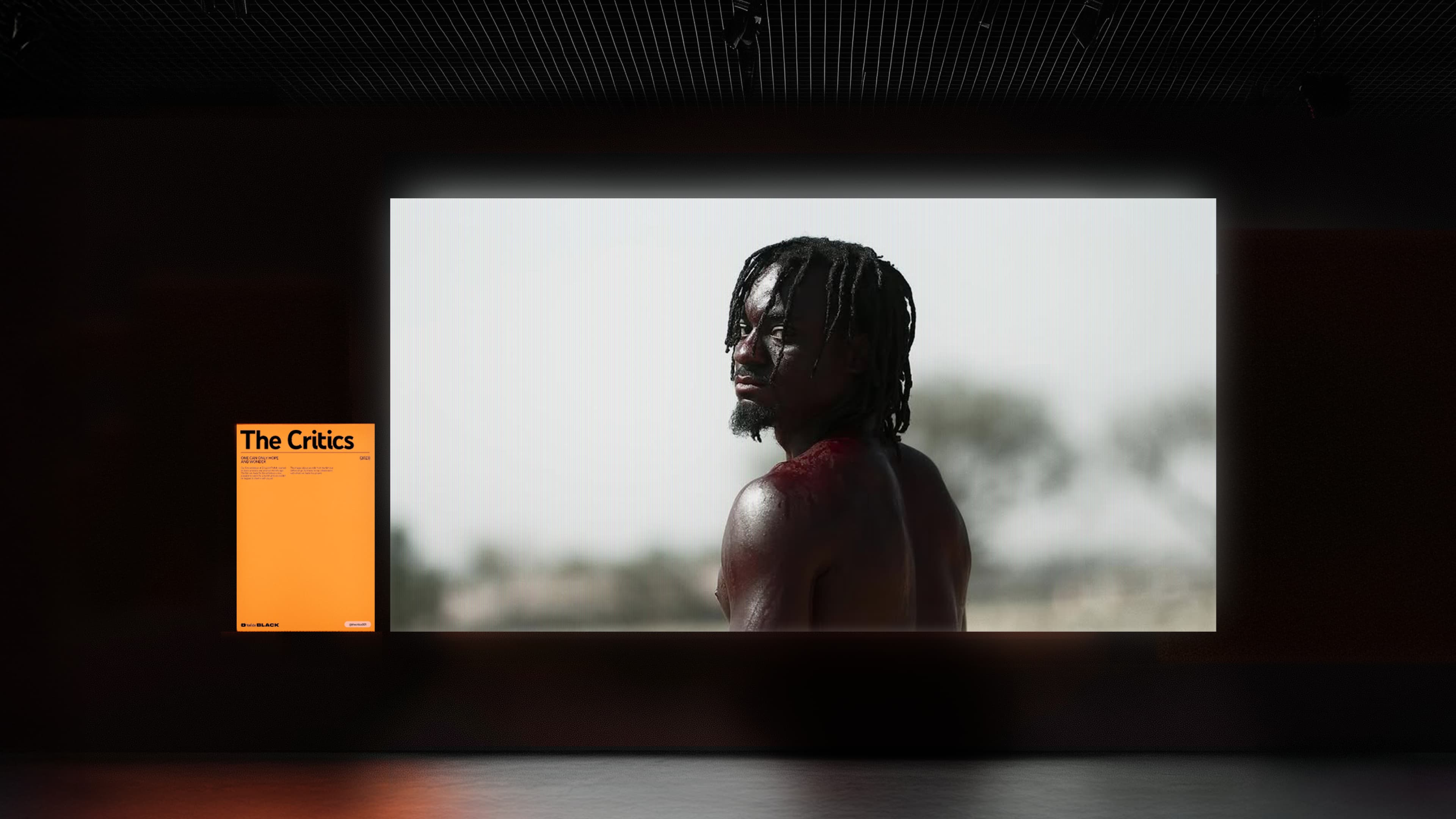
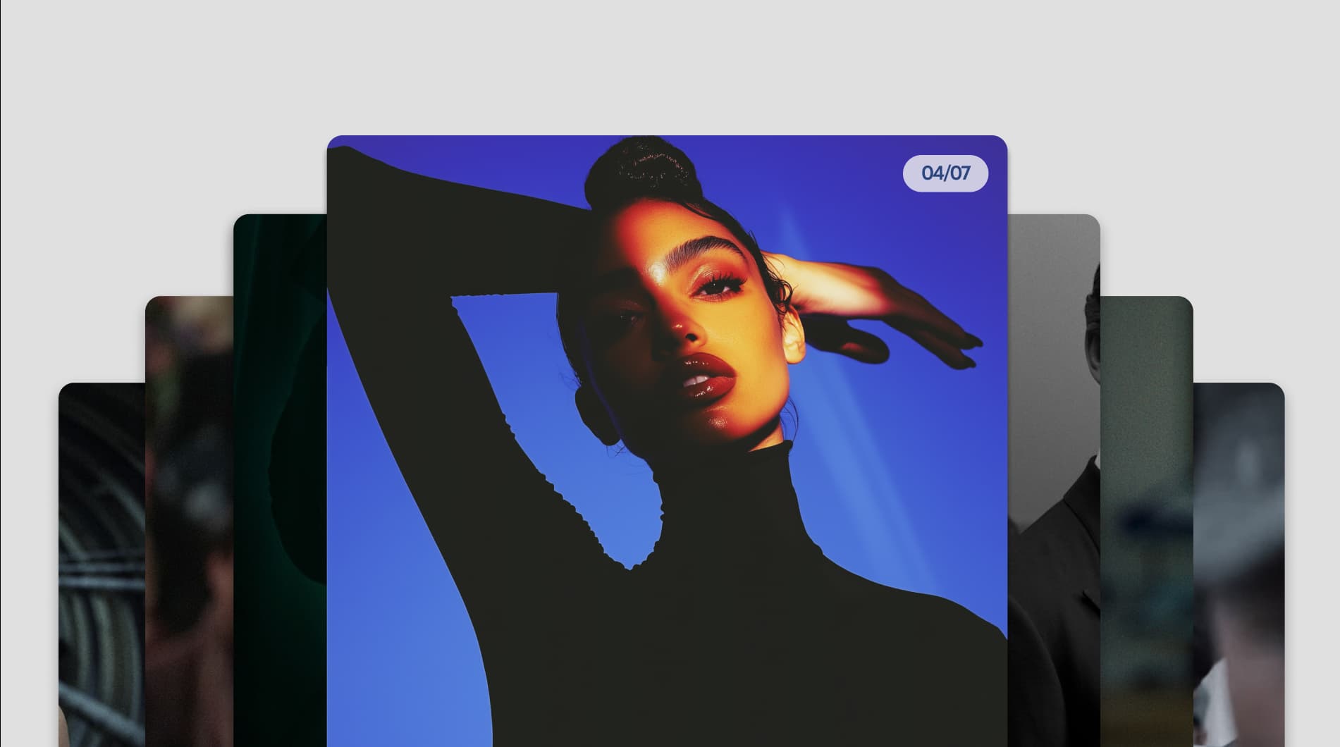
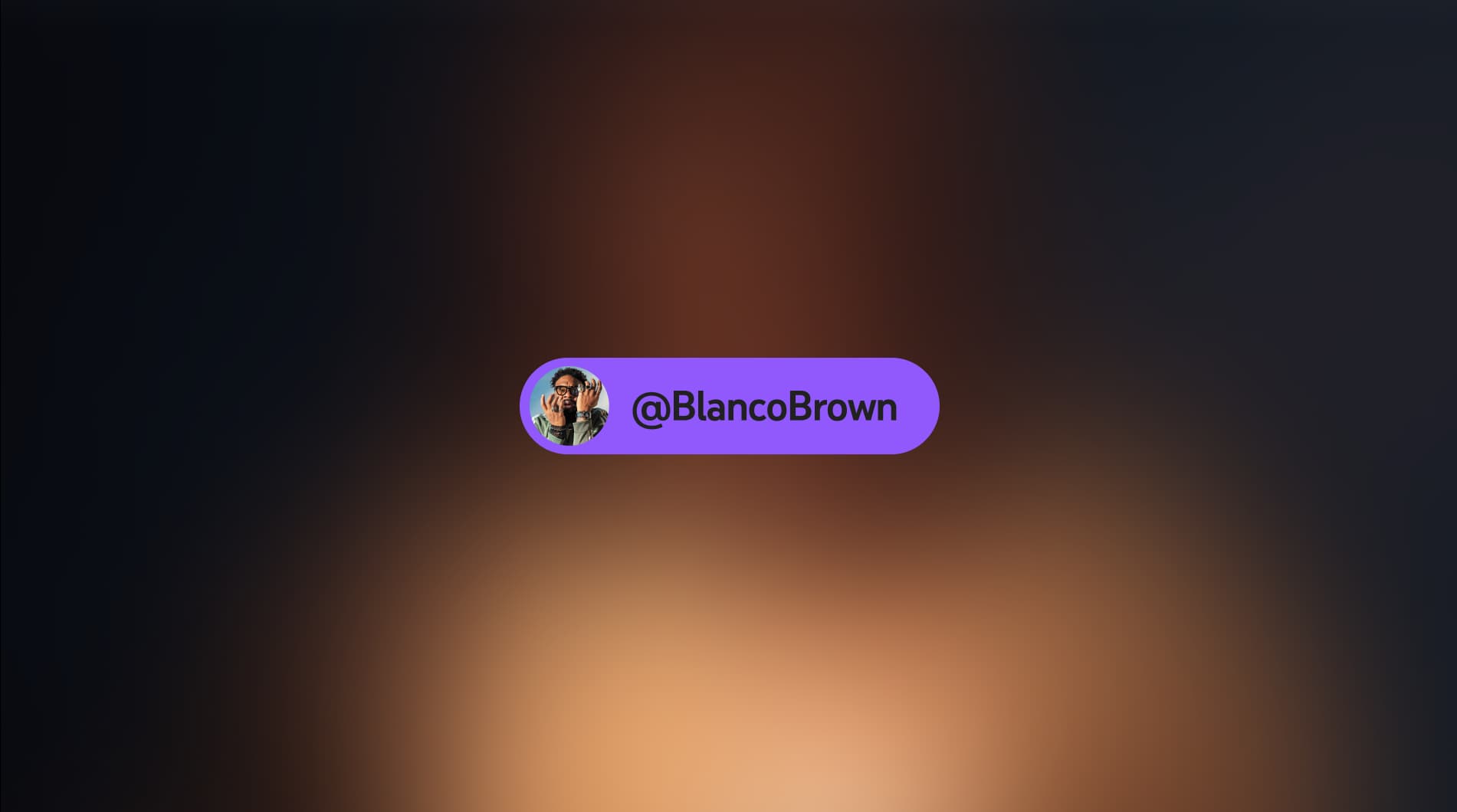
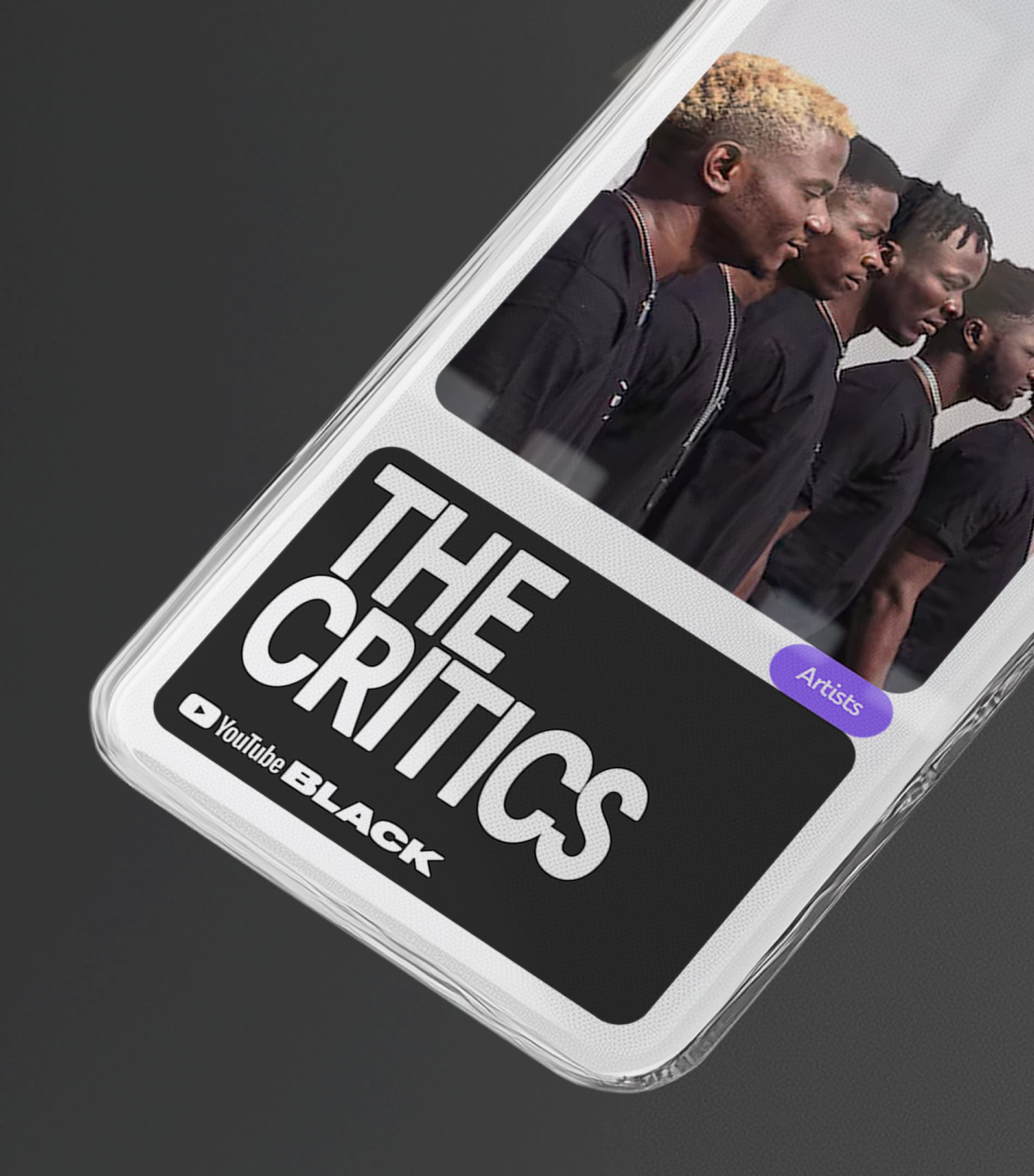
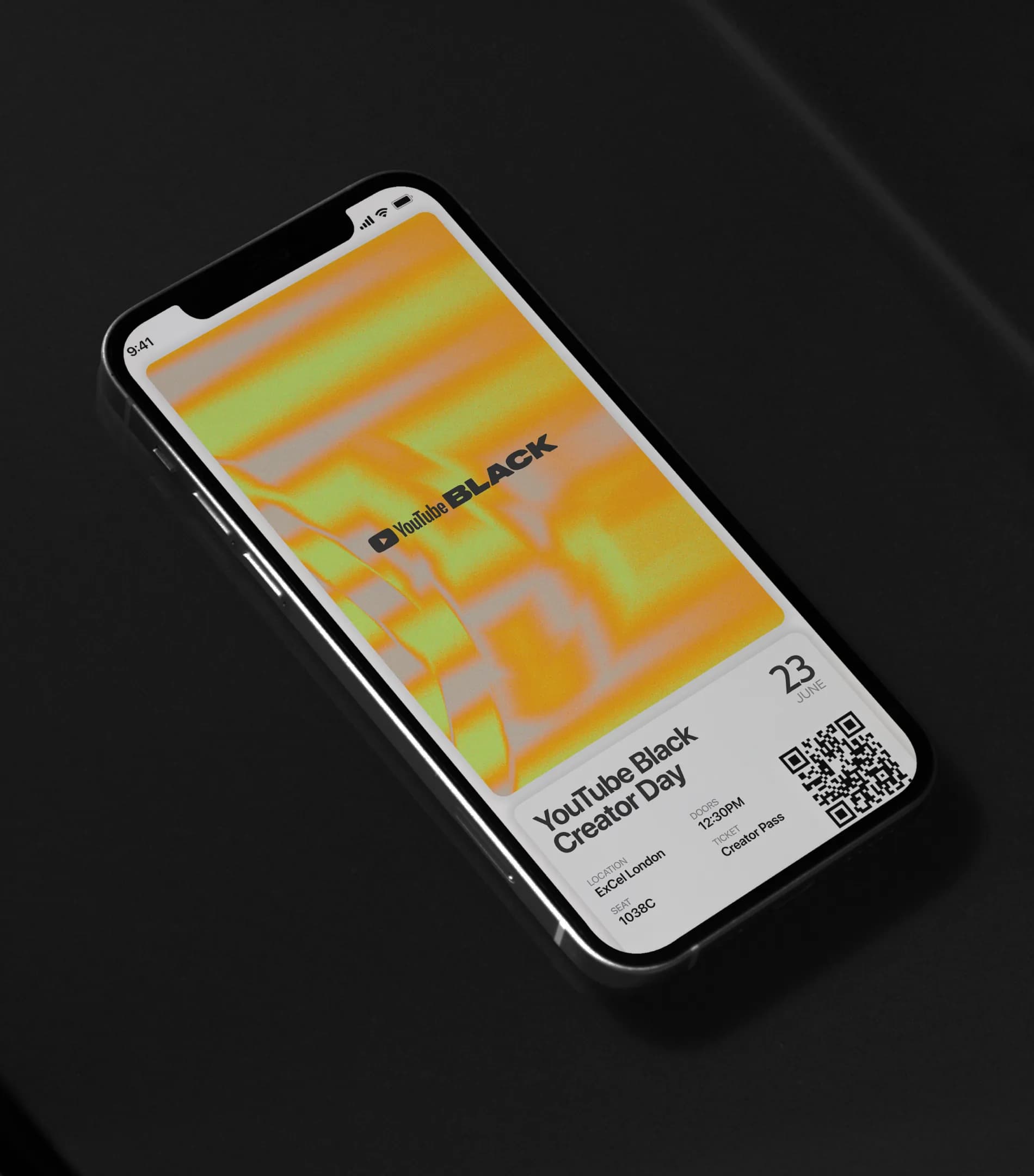
The wordmark bolds "Black" over "YouTube", flipping the standard sub-brand hierarchy so the community leads and the platform supports. The graphic system runs on three elements. Type sets the tone: bold, confident, high-impact. Frames provide flexible containers that put creator content at the centre, layering and building to make amplification structural rather than conceptual. Textures are derived from creators' own audiovisual material, meaning the brand literally looks different every time because the creator's work is the variable. A more complex visual system would have competed with the content it exists to amplify.

Become
A creator spotlight pulls textures from that specific creator's audiovisual content into the frames, making each application visually unique while the structure holds. An event like the Creator Summit uses type, frames and textures at full scale across environmental, digital and print. The system operates across eight countries, and because the creator content that populates it is locally specific, the brand naturally reflects the diversity of the global Black diaspora without requiring regional visual adaptation.


Unmistakably YouTube Black
#YouTubeBlack moved from a hashtag to a branded platform with its own visual identity, tone of voice and creative system. The identity belongs visually to the creators rather than to the corporation, which is what gives it a credibility most corporate community programs cannot access. Tech platform diversity initiatives that lead with parent-brand aesthetics now look like they are talking about a community rather than speaking as one. Black creatives were embedded in strategy, language and design throughout, not consulted after the fact. That distinction is structural, not cosmetic.
Strategy Scope
Brand Strategy
Tone of Voice
Creative Scope
Visual Identity
Typography
Illustration
3D
Motion Identity
IRL Application
Brand Guideline
Global Toolkit
Studio NARI team
Caterina Bianchini
Creative Director
Design Director
Designers
Designers
Strategy
Ennie Fakoya
Tone Of Voice
Project Manager